September 16, 2022
A Simple Svelte Tabs Component
Justin Golden

The Problem
Most tab components I found either involve getting an entire UI kit, a lot of boilerplate code per implementation, or more likely, the code looks like this:
(This was my old code; I had to zoom out twice to get this screenshot)
The Props
We’ll simply export a list of tabs and then the index of the activeTab:
export let tabs,
	activeTab = 0;
The HTML
The Tabs
We want to loop through each tab and render them as a button with the tab name and with class tab for styling later.
{#each tabs as tab, idx}
	<button class="tab">
		{tab.name}
	</button>
{/each}
Let’s apply an active class if the tab is active:
class:active={idx === activeTab}And let’s set the activeTab on click:
on:click={() => (activeTab = idx)}So far we’ve got:
{#each tabs as tab, idx}
	<button class="tab" class:active={idx === activeTab} on:click={() => (activeTab = idx)}>
		{tab.name}
	</button>
{/each}
The Tab Content
Now let’s render the content for each tab. We will only show the content for the active tab, and it will be a component like so:
{#each tabs as tab, idx}
	{#if idx === activeTab}
		<svelte:component this={tab.content} />
	{/if}
{/each}
We simply pass in a component into tab.component. I’ll show you under Usage.
The CSS
Let’s style our tabs, and make sure to style our active tabs differently.
<style lang="postcss">
	.tab {
		background-color: #f4f4f5;
		padding: 1rem;
	}
	.tab.active {
		background-color: #e4e4e7;
	}
</style>
You can of course add your own styles; this is just a bare minimum to get the component going. I’ve got some default styles in my project so my tabs may look a bit different from yours.
All Together Now
Here’s the full file: 25 lines!
<script>
	export let data = {};

	$: tabs = data.tabs;
	$: activeTab = data.activeTab ?? 0;
</script>

{#each tabs as tab, idx}
	<button class="tab" class:active={idx === activeTab} on:click={() => (activeTab = idx)}>
		{tab.name}
	</button>
{/each}

{#each tabs as tab, idx}
	{#if idx === activeTab}
		<svelte:component this={tab.content} />
	{/if}
{/each}

<style lang="postcss">
	.tab {
		background-color: #f4f4f5;
		padding: 1rem;
	}
	.tab.active {
		background-color: #e4e4e7;
	}
</style>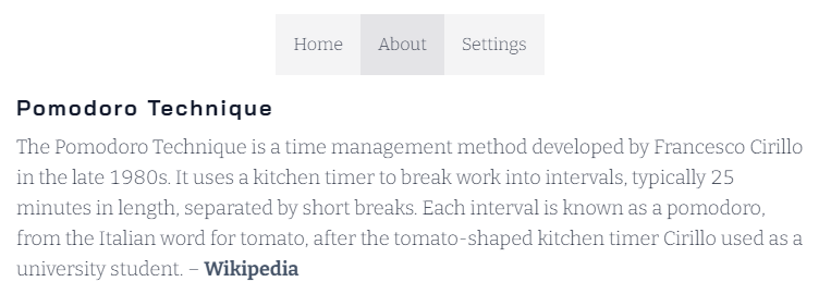
Usage
Here’s how you would use the tabs component in your app:
import Tabs from '$lib/components/Tabs.svelte'; (or wherever you saved it)
<Tabs
	tabs={[
		{ name: 'Home', content: PomodoroHome },
		{ name: 'About', content: PomodoroAbout },
		{ name: 'Settings', content: PomodoroSettings }
	]}
/>
This of course has you importing the components from other files. I find it best practice to split things up into smaller files when possible, so long as the file structure is organized and it’s not cluttered.
Expanding
Transition
To add a transition, simply import from svelte/transition:
import { fade } from 'svelte/transition';Then wrap the current tab in a div with in:fade:
<div in:fade>
	<svelte:component this={tab.content} />
</div>
Icon
You could add an icon to each tab:
<button class="tab" class:active={idx === activeTab} on:click={() => (activeTab = idx)}>
	<Icon name={tab.icon} />
	{tab.name}
</button>
If you have an Icon component, and then implement it like so:
<Tabs
	tabs={[
		{ name: 'Home', icon: 'home', content: PomodoroHome },
		{ name: 'About', icon: 'info_circle', content: PomodoroAbout },
		{ name: 'Settings', icon: 'cog', content: PomodoroSettings }
	]}
/>
I couldn’t find any good examples of tab components in Svelte that weren’t either unnecessarily complex (involving multiple files, dozens of lines of CSS, getting and registering context and writables) or just hard coded and involving too much copy-paste boilerplate code to use every implementation.
I hope this article helped you out. If so, feel free to share or check out our other stuff : )
More Blog Articles