December 11, 2022
Everything You Need to Know About Optimizing Images on The Web
Justin Golden

Length: Medium
Level: ✓ Beginner ✓ Intermediate ✓ Advanced
Intro
Images are a great way of making your content pop, splitting up lengthy text, and demonstrating content in a visual and intuitive manner. However, they often have a horrible impact on website performance, visitors, SEO, and conversions. In this article, you’ll learn everything you need to know to make sure your images load quickly, work on all browsers, and improve your SEO and page rankings.
How bad is my site?
First, check your network transfers in the inspector. Right click the page and click “Inspect” (or hit ctrl+shift+i) then choose “Network” on the top. Next, hard refresh your page (ctrl+shift+r) and check your network waterfall. You can see how many requests and how many kb or mb were transferred below as well as how many ms or s it took. You can also sort by type (to find images for example), sort by size (to see the largest files), sort by time, view the waterfall (when and how long it took to connect, send a request, and download content). You can also check for 400 and 500 errors here (to see more about different status codes on the web, check https://justingolden.me/status-codes).
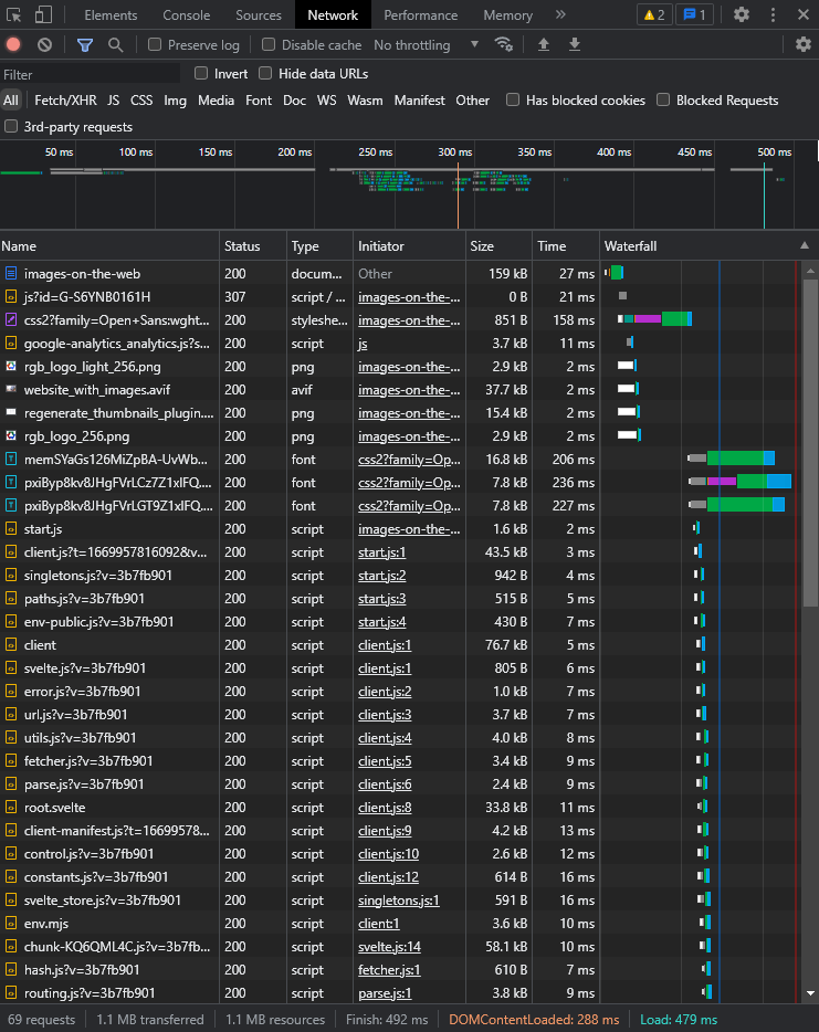
If over 2mb are sent, you should strongly consider improving. If you have any images over 100 or 200 kb you may also want to look into resizing, compressing, and/or other file formats (read more below).
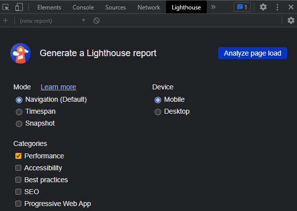
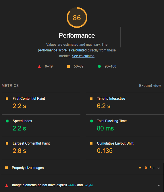
Second, you’ll want to check performance in Google Lighthouse. See if there are any suggestions on how to improve images, such as properly size images, or set an explicit width and height. You can expand the accordion to view more details and read articles on each individual topic from here.
Compression Types
Lossy: This image compression results in an image that looks different from the original in order to result in even mroe file size savings.
Loseless: This type of compression results in a smaller file size without any change to the pixels in the image.
What Images are Made of
Each image is made up of thousands to millions of pixels. Each pixel is a square in a grid with a red, green, and blue (the primary colors of light, which is additive to form white light) value between 0 and 255 (resulting in 256 unique values, which is 2^8, 8 ones or zeros, so 8 bits, which is 1 byte). Each pixel takes up 3 bytes (or 4 if another byte is used for transparency, sometimes called alpha). A pixel of red, green, and blue can display one of 16,777,216 colors (256^3 or 2^24) These millions of pixels are then rendered to your screen. Each pixel on your screen (and your users screens :) has a red, green, and blue light that are lit up a certain percentage for each color. A 1920 x 1080 image has 2,073,600 pixels. So 2 million pixels, each of which takes up 3 bytes, so 6 million bytes or approx 6mb for an HD image, right? Well, not quite; with compression, these images become much, much smaller. Nearly every image type has built in compression. All of the JPEGs and PNGs you’ve seen have already been compressed and adhere to a specific standard for their file type, so you can scroll through images on social media mindlessly that much faster : )
So I have to admit, the above section was a lie. But only the first two words, “each image.” Vector images are NOT made up of pixels, but rather paths that contain lines, curves, and other shapes. Think of it as a series of mathematical formulas for how to display the iamge rather than a bunch of squares. Vectors are commonly used for icons, logos, and digital designs. Like Photoshop and Gimp are used for raster (pixel based) images, Illustrator and Inkscape are used for vectors. In addition to icons and logos, you also see vectors used in font files (well, 99.99% of the time anyway). Vectors have a few major advantages over pixel based images: 1) they scale infinitely, meaning at any screen size or any print they will never pixelate or blur, and 2) they generally take up significantly less space. However, they often aren’t an option, as most images have some relation to an image taken from a camera, which should generally be kept as pixel based (you can image trace to convert a raster image to a vector, but you would never do this on a camera image due to a high loss of quality).
Image types
The most common image formats are as follows:
Widely supported:
jpgorjpegimages are lossely compressed images and often come from photographs and would include photographs edited afterwards or images containing photographs in them. These files are standard nearly everywhere, are compressed well and still have good quality. These are a very common choice across the internet.pngsupports transparency and loseless compression and is another very common image format. PNG images are often created when you need to export your design as a raster image.svgmakes a great choice for vector files such as icons and logos. They are generally smaller file sizes and have infinte quality, so they’re usually a win-win, and they have been widely supported for many years. If you want to experiment more with SVGs, check out (yqnn.github.io/svg-path-editor)[https://yqnn.github.io/svg-path-editor/]. Any vector image editor such as Adobe Illustrator will let you export your images as SVG.gifpronounced gif or gif, is a moving image. These are often either highly compressed and low quality or very high file size. They are like a video without sound that automatically loops and can’t be paused. That being said, they are useful in some contexts, and can be used for still images for very small file sizes and are very widely supported.bmpthese images are uncompressed and are designed to store photos for print or high quality images for easy access. You should not use these on the web since they are uncompressed.tiffortifthese are popular among graphic artists and photographers for adding additional meta data (data about the image). They are losslessly compressed and are widely supported, but not quite as supported or common as JPG or PNG.
Newer worth mentioning:
These formats have great compression but need fallback images to ensure your image is rendered for everyone.
webpcame out recently and has taken the web by storm. It’s immediately garnished a lot of support, but is still unsupported by many older browsers and some newer ones, requiring a fallback if you choose to use it. They support transparency, and can be lossless or lossy depending on your preference. Read more on Google’s post about webp. They compress images very efficiently and are a great choice on the web so long as you have a fallback JPG or PNG.avifimages are becoming very popular and also have amazing compression. AVIF can make sure your images are super, super small, while only slightly compromising on image quality. Note that at time of writing, Edge does not support AVIF.
Check Can I Use when using any format other than JPG, PNG, SVG, or GIF. Note that SVG is supported in certain contexts but not others on different browsers.
Read more about AVIF and WEBP.
Note that favicons are their own can of worms, and most browsers support PNG favicons, but ico files are specifically made for favicons and support multiple different resolutions. Generally, your favicon should be so small that it should be insignificant for performance, hence its omission here.
Also note that very large vector animations can also be very slow.
Palette
RGB means that red, green, and blue each have 2^8 options, which results in 2^24 or about 17 million colors. If your image has fewer colors (for example, 256 colors) this can result in smaller image sizes. Changing color palette (in addition to changing dimensions, compression algorithm, file format) is commonly an option in image compression tools.
How Compression Works
Image compression is very complex, but the TL;DR is that many mathematical algorithms are used to store similar data and data in patterns efficiently, as well as (lossy only) manipulate the data to follow these patterns and round off less noticeable data.
You should know that images with less “stuff going on” will take up significantly less space than their counterparts of the same dimensions.
Learn more about image compression algorithms and strategies from this video: The Unreasonable Effectiveness of JPEG: A Signal Processing Approach
Accessibility
Accessibility is important not just for impaired users, but for everyday users, slow connections, and even affects your page ranking on Google.
Label it:
The easiest first step (and a necessary for every image) is to add an alt tag (or a title but that would show a tooltip on hover). These are used by screen readers, for SEO (if images are used as links, but also as part of your page ranking on Google), are used during slow connections, and if your image doesn’t load.
These tags should describe what the image is, and if it acts as a link or button, what it does. Pretend you’re talking to someone who is blind and describing the image, for example, “a woman walking down the beach” or “rgb studios logo” or “main menu.” If the image doesn’t have semantic meaning, you should still add an alt tag and just leave it empty: alt="". This is so screen readers and crawlers know that this image has no meaning on the page and can skip over it.
You can also use a figcaption inside of a figure tag to describe the image. This renders the text to the screen, similar to a <p> tag:
<figure>
	<img src="website_with_images.jpg" alt="a website with images" />
	<figcaption>Photo credit @domenicoloia on Unsplash</figcaption>
</figure>
You can also use figure and figcaption with a fallback image:
<figure>
	<picture>
		<source type="image/avif" srcset="website_with_images.avif" />
		<img src="website_with_images.jpg" alt="a website with images" />
	</picture>
	<figcaption>Photo credit @domenicoloia on Unsplash</figcaption>
</figure>
You can read more about fallback images below.
Web Core Vitals (WCV)
WCV shows you data and actionable steps to improve user experience, bounce rate, and your page SEO.
Run Lighthouse (see above) to scan your page and find steps you can take to improve your accessibility and performance.
Bad website performance leads to a higher bounce rate and less conversions, a lower page ranking on Google, and frustrated users.
Key points are that resizing images takes time, and larger images (especially ones larger than you need) take time (you can serve users smaller images based on the width of their device; read below about picture tags with sources that set their media attribute).
Actionable Steps
Check your image dimensions. If they are way too big, then serve users only images as large as they need. You shouldn’t need to serve an image in full HD for example. You can use the inspector to see what computed size the image is, and check different screen sizes as well.
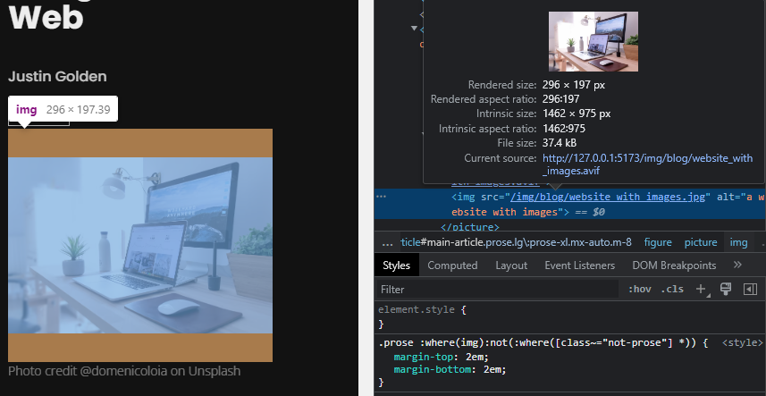
Note how above the rendered size and source size are shown, and dramatically different.
Find out what size image is being served. In addition to taking time to send a larger image, it takes time on page load to resize images, which is bad for performance, and decreases your performance score on WCV, which can decrease your page ranking.
Serve images in next generation formats, such as webp and avif mentioned above. Be sure to support older browsers with fallbacks (see below).
Use a good CDN or serve them yourself. If you serve your images from a CDN, you want that CDN to be fast and have a high uptime (see the CDN section). A slow CDN may take a lot of time to serve your images, or even just a lot of time to respond to the request. A fast response time means your images render faster, which has a significant affect on WCV.
Cache your images (see below).
Preload your images (see below).
Preloading Images
Preload your images with a link rel="preload" in your header:
<link rel="preload" href="my_preloaded_image.png" />Then use the image later:
<img src="my_preloaded_image.png" alt="" />See web.dev for more info on preloading images.
Next Gen Images and Fallbacks
Fallback images are necessary in order to support browsers that don’t support the latest image formats. For example, avif comes with a potential savings of a lot of bytes, but a large portion of your users would see no image at all if you don’t add a fallback. Get the best of both worlds (serve everyone and pass on potential savings to users who can) by providing a fallback.
For example, “website_with_images.avif” might be your much smaller image, but users on Edge or on older versions of Chrome, Firefox, and Safari might not be able to view AVIF images, so “website_with_images.jpg” is your fallback JPG image.
Use the <picture> tag for fallbacks.
<picture>
	<source type="image/avif" srcset="website_with_images.avif" />
	<img src="website_with_images.jpg" alt="" />
</picture>
The picture tag works by trying to load the first image it can from source and if it fails (or isn’t supported), it will fallback to the img tag which is supported everywhere. Note that adding an alt, title, class, or any other attribute to your img take will suffice and the source images will use those attributes.
Check “Can I Use” as mentioned above to check support for your image (for example, Can I Use AVIF). Generally, you should fallback to a JPG because they are supported everywhere and feature decent compression. Check major browsers (at time of writing, Chrome, Firefox, Safari, Edge, IE, Opera, Brave) and test on Android, iOS, Windows, and Mac.
Different Images on Different Screens
You can also use the picture tag to serve different quality images to different users based on their screen size.
<picture>
	<source media="(min-width:650px)" srcset="img_pink_flowers.jpg" />
	<source media="(min-width:465px)" srcset="img_white_flower.jpg" />
	<img src="img_orange_flowers.jpg" alt="Flowers" style="width:auto;" />
</picture>
You can play the above example to see it live. You can also check the Network tab of the inspector to see the network requests come in as you resize your client window.
Note that unlike the above example, which is only shown as demonstration, usually, you would want to show users the same image, just at different dimensions.
You can combine fallback images and media attributes to serve images based on both browser support and media size. The browser will serve the first source tag that it supports and that has a media query matching the user’s device.
Resources for Compressing
Squoosh.app is an amazing tool by Google that allows you to compress images, change size, palette, and more. You can change to different image formats and view a side by side. If you learn nothing else from this article, just throw your images into Squoosh and choose a JPG with smaller dimensions and you’ll make your page a lot faster. But of course, you’ll want to fine tune to your goals and ideally add support for webp or other next gen formats for additional savings.
Smush Pro is a plugin for Wordpress that will automatically compress your images (for image SEO in Wordpress, consider Yoast SEO and read up on their image options).
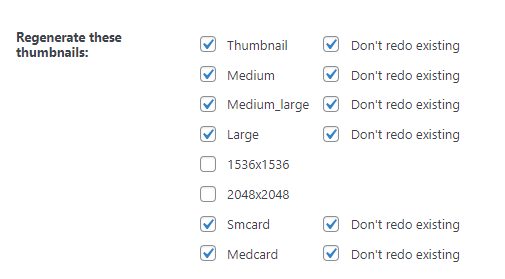
Regenerate Thumbnails Advanced is another Wordpress plugin that will generate the correct sizes for your images, so you can serve them to a picture tag with different media sets. You can add the folloing code to your functions.php in your Wordpress theme:
add_theme_support('post-thumbnails');
add_image_size('smcard', 360, 270);
add_image_size('medcard', 480, 360);
Then generate the images with the following UI:
The code to consume the images in your theme should look something like this:
$attachment_id = get_post_thumbnail_id( $post->ID ); // thumbnail ID
$img_atts = wp_get_attachment_image_src( $attachment_id , 'medcard' ); // image url, width, height
$img_title = ""; // get image title somehow<picture>
<source media="(max-width: 960px)" srcset="<?php echo $img_atts[0]; ?>" />
<source
media="(max-width: 1280px)"
srcset="<?php echo wp_get_attachment_image_url( $attachment_id, 'smcard' ) ?>"
/>
<img
class="rounded"
src="<?php echo $img_atts[0]; ?>"
width="<?php echo $img_atts[1]; ?>"
height="<?php echo $img_atts[2]; ?>"
alt="<?php echo $img_title; ?>"
/>
</picture>Note that wp_get_attachment_image_src returns a list with the image URL (0), width (1), and height (2).
For image compression via command line, check this stack overflow post.
Resizing vs Compression
Resizing your image changes the dimensions of the image, in other words, how many pixels there are in the image. If the image will be resized by the browser client, you may as well resize it to that size first to save the browser work and decrease image size.
Compression does not change the dimensions of your image, but instead uses algorithms (see above) to make your image take up less space, sometimes by slightly changing pixels (lossy) or without changing pixels (loseless).
CDNs
A CDN or content delivery network is a group of servers that work to deliver content quickly on the internet. The best ones are fast, have multiple servers across the world to serve files from servers closest to the end user, and have high up time (meaning they are rarely down).
Using a good CDN is very important for images as they are likely among the largest and slowest loading files on your website. A bad CDN can decrease your Lighthouse performance score which also affects your SEO, and a good CDN will server images quickly, resulting in faster loading times for your users and better page rankings.
Caching
Your server can cache various sizes of images to ensure they are ready for users with various screen sizes.
(If you’re using Next JS, check out ISR).
Different Displays
Displays can differ in screen size (physical in/cm), number of pixels, ratio (width vs height), pixel density (pixels per in/cm), and more.
Common screen sizes:
Laptops are usually 13-15in diagonally, but sizes up to 17in or down to 11in are also common.
Phones are usually about 6in and range from around 5-7in.
Common screen dimensions:
1920x1080 (full HD)
1366x768
1440x900
1536x864
1024x768
1280x720 (720p)
2560x1440 (QHD)
1600x900
3840x2160 (4K)
360x640
375x667
414x896
360x780
375x812
Screen Ratios:
Most screens are usually 16:9 or 16:10 (also 8:5). Some monitors are 21:9 (ultrawide) or 32:9 (superwide). Before 16:9 was standard, 4:3 was very common:
- 16:9 aspect ratio: (modern standard) 1366 x 768, 1600 x 900, 1920 × 1080, 3840 × 2160, 2560 × 1440.
- 4:3 aspect ratio: (old standard) 1400 × 1050, 1440 × 1080, 1920 × 1440.
- 21:9 aspect ratio: (ultrawide) 2560 × 1080, 3440 × 1440.
- 32:9 aspect ratio: (superwide) 3840 × 1080
Source: HP
Videos are usually 16:9 or 1.85:1. See comparisons at nofilmschool.com.
Pixel Density:
Pixel density is generally measured in PPI, or pixels per inch. 80+ PPI on monitors is common, while smart phones will vary but range around 300 PPI. The human eye generally can’t distinguish past 300PPI. Bad or low PPI means that you are more likely to see pixels and pixelation on your screen. Perception is based on how far you are from your display, which is why smart phones have significantly higher pixel density. Larger screens don’t require as high a pixel density as generally you’re further away from them (in order to see the full screen). This is more in the monitor/display space and less related to images on the web, but it’s important to know that different displays render images in different ways. (Different displays also use different pixel technology such as LED, LCD, IPS, and OLED; again, largely off topic)
Your Image Sources
Don’t link to images from other websites and instead download and serve them. This is because website links can change or be removed, serve another image, redirect, etc. and you don’t want your image to change to something else or go missing.
Image SEO
- Use relevant images on your website.
- Add appropriate and descrptive alt text, titles, captions, and file names (yes, file names matter).
- Put your important images at the top of the page.
- Add high quality content to your website to increase your image SEO
- Add a sitemap with images (you can use yoast SEO on Wordpress for example)
- Use responsive images (serve users appropriate images based on their device, see above)
- Add image schema to your website (see Schema Pro)
Read Google’s image seo best practices for more.
What if my images are too ugly / small / compressed?
The best solution would be to find the original source. When compressing or resizing images, ALWAYS hold on to the original. If you can’t find the source, create a new image yourself, find a replacement image, or comission one. Lastly, you can consider using AI to upscale your image like magic but it’s a bit expensive at time of writing (really cool though).
Closing
This post went a bit long, but I wanted to delve into just about every topic relating to images on the web. There’s a lot of information, and this certainly isn’t comprehensive, but the goal was to give you a bit of info about nearly every category so you can determine what you want to look into next, as well as tell you what your problems are, why you want to solve them, and actionable steps to solve them and improve your website.
More Blog Articles