December 11, 2022
The Definitive Guide to Typography on the Web
Justin Golden

Overview
TL;DR
Use two fonts that contrast either font weight, serifs, or both. Chose a “boring” and readable font for your body copy and ensure your letter spacing, line height, and line length don’t hinder readability.
Summary
This will be a crashcourse on the fundamentals of typography on the web, in print, and for your brand. There is an ever-evolving landscape of font families, styles, and choices in the modern era, and this guide will help you know what to look for and make the right choices, leaving your users happy and your message received.
Why You Care
Typography is two-fold: aesthetic and practical; an art form and a means to convey a message.
Good typography will:
- Allow readers to comfortably consume your message
- Increase accessibility on numerous devices and mediums for a wide audience
- Keep users around longer and keep them coming back
- Add a consistent branding and trustworthy name to your company
Bad typography will:
- Push would-be readers away
- Make it difficult for your message to translate between various screen sizes
- Prevent users from returning to your company or website
- Tarnish your brand
Just like a logo or a color palette, typography is an integral part of your brand.
Basic Terminology
A typeface is a group of fonts that all have a consistent aesthetic. A font is a specific instance, for example, font weight (bold, semibold, thin) style (italicized), size (12pt, 16pt), and more (condensed, extended, small caps). A letterform is a single specific character in a font, for example, a lowercase “a.”
Letterforms
A letterform is a specific character and its shape, in context of a specific typeface or font. A glyph is a representation of a character, commonly used in context of a collection of glyphs. A single character can have multiple glyphs, for example, multiple glyphs for the character “a” or “1.”
There are numerous terms used to describe letterforms, but we’ll go over only some of the basics here.
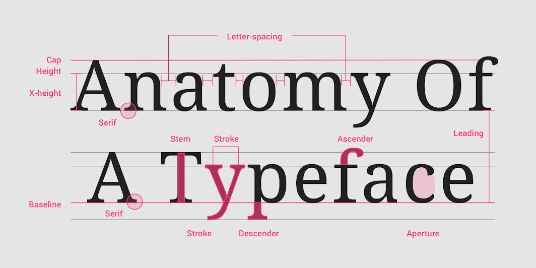 Image from material.io
Important Lines
The baseline is the line that all characters sit on. Note that descenders can go below this.
The x-height is traditionally the height of a lowercase “x” and is often a marker for the height of lowercase letters. This is very important for legibility.
The cap height is the height of a capital letter.
Ascenders and descenders go above the x-height (and usually above the cap height) and below the baseline respectively. Lowercase “b” and “d” typically have ascenders and lowercase “g” and “p” are good examples of letterforms with descenders.
Quick take away: x-height is typically used as a measure of readability and aesthetic (well specifically relative to the cap height). Other lines are generally relative to the ratio between the x-height and cap height. Often when referring to “x-height,” people mean the ratio between the x-height and the cap height.
Font Variants
 Image from nngroup
Font weight refers to how thick the typeface’s stroke is in general. Often, fonts use a scale between 100 and 900 in incremenets of 100 where the larger number coresponds to a larger font weight. Most typefaces have a small number (sometimes just one or two) hand crafted font weights, with some professional typefaces featuring seven to nine. Variable font weights are a recent development that allow the end user to fully customize the font weight. (Website performance note: each additional font variant will significantly impact performance).
Common font weight names:
- 100 - ultra light, extra light, or thin
- 200 - ultra light, extra light, or thin
- 300 - light
- 400 - regular, or normal
- 500 - medium, or book
- 600 - semibold or bold
- 700 - bold or heavy
- 800 - extra bold or black
- 900 - extra black or black
Tailwind CSS has some reasonable font weight names if you’re looking for a standard: thin, extralight, light, normal, medium, semibold, bold, extrabold, black.
You can also use the numbers 100, 200, 300, 400, 500, 600, 700, 800, 900 as font-weight values in CSS, or use normal (which is 400) or bold (which is 700) or values relative to the parent lighter or bolder. For more as well as common weight names, check Moz Docs.
Font width refers to how “streched out” the letterforms are. Generally, you want to avoid using other widths unless it’s for stylistic effect, for example, a heading. Normal width is best for body copy.
Common width / proportion names:
- extra condensed / extra compressed
- condensed / compressed
- semi condensed / semi compressed / narrow
- regular
- wide
- expanded / extended / extra wide
Parts of a Letterform
 Image from google fonts
Contrast refers to the difference between the thick and thin parts of the stroke in a letterform. Monolinear types such as slab serifs have very low stroke contrast, whereas fatface fonts (such as Abril Fatface) have greater contrast.
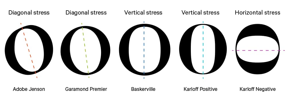 Image from quora
The stress of a letterform refers to where the stroke width changes on the letterform. Some typefaces have a near vertical stress, resulting in a balanced appearance. Other typefaces have a diagonal stress, to emulate a calligraphic style.
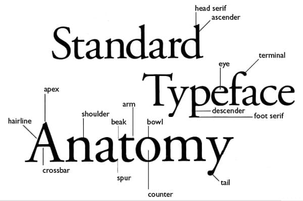 Image from design modo
The terminal is the ending of a stroke. This is relevant because many letterforms will have stylistic terminals that can be curved or balled that change the perception of a font both in aesthetic and in legibility.
The ink trap refers to the negative space (or lack thereof) inside of a letterform that would traditionally be used to trap ink when printed (or stamped), but is now (as many other aspects of typography) an artifact of older technologies that remains popular for stylistic reasons.
The aperture is the opening, notably in lowercase “a” and “e” which has a sizeable impact on both aesthetic and readability (notably, lowercase “c” can be confused with “o” if the aperture is too small).
The bowl is the stroke around a curve in a letterform, such as in the “o” or “a.”
There are many, many other parts of a letterform such as the crossbar (horizontal line within as seen in “A” or “H”), and the stem (vertical stroke as seen in “I”, “H”, “W”), but I’ll be keeping this section brief to focus on the primary anatomy necessary to make type decisions, rather than highlighting all terminology necessary to design a typeface yourself.
Font Classification
Serifs
Serifs are the small pointy bits at the end of a letter. They are generally used for body copy because they are more comfortable to read. Serifs originate from when chracters were created with a chisel on stone.
The two main categories of fonts are serifs and sans serifs (“sans” comes from French for “without,” meaning without serifs).
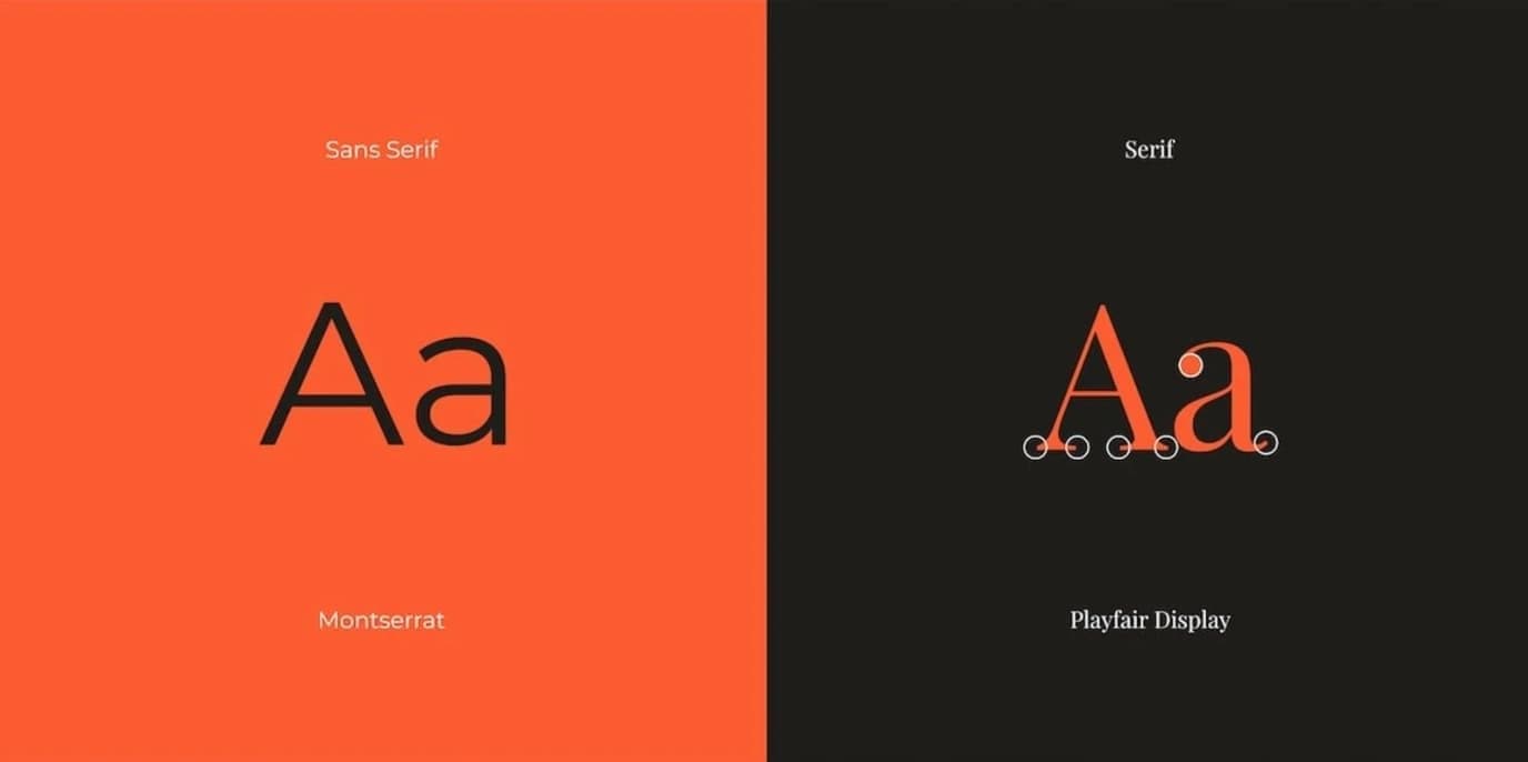 Image from canva
Usages
A font is like a tool in a toolbelt. Not every tool is for every job. Just like you wouldn’t hit a nail with a screwdriver, you wouldn’t use comic sans for a wedding invitaion. But you could use it for an invite for a four year old’s birthday.
Different fonts convey different messages.
Serifs are usually used in print, and are considered more traditional and formal. They improve readability in print. Sans serifs are cleaner and simpler, and the lack of serifs (especially before modern high density displays) make them easier to read on screens. They are considered modern and clean. Both serifs and sans serifs can make fine choices for many usages (but you’ll have to get into more specifics to find the right one).
Other Classifications
Below you’ll find a brief overview of some other classifications. We’ll go into mroe detail later.
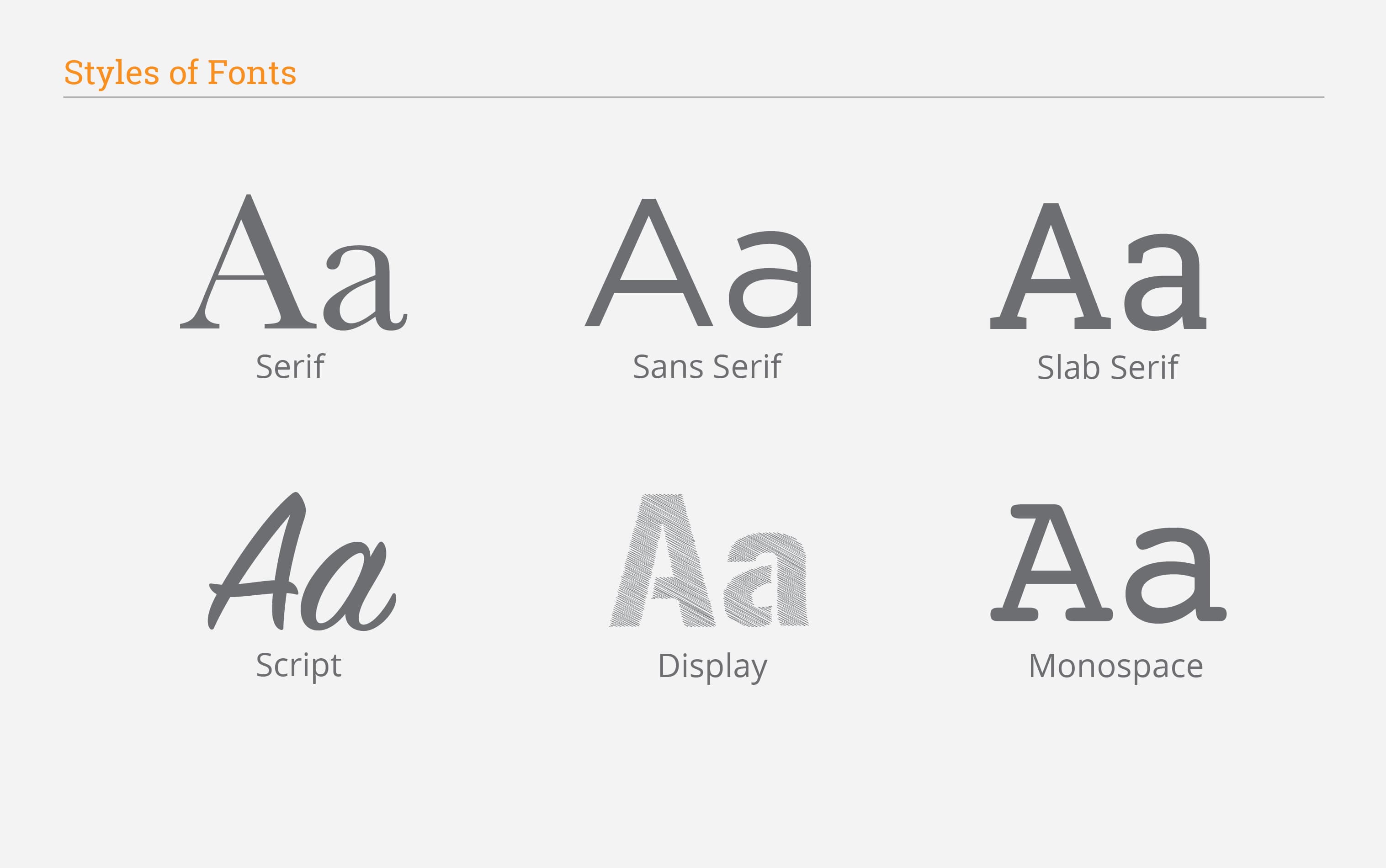 Image from randall branding
Slab serifs (or Egyptian fonts) feature serifs (and letterforms in general) that have very low or no stroke contrast (nearly uniform line width), often resembling sans serifs but with a uniform width line as a serif. They are usually either fairly bulky or fairly light. The bulkier ones are typically what one thinks of when they hear “slab serif” and are thought of as sturdy or hardy, possibly related to nature, earthy, and trustworthy. Thinner slab serifs are a trendy design and can, on the other hand, look modern and both quirky and aesthetically pleasing.
Monospace fonts have all characters the same width and are commonly used for programming or in tallying such as reciepts. They are also used for screenplays and provide the appearance of a typewriter. Unless you’re going for a very specific and eye catching design, I would not use these unless it is absolutely necessary that all characters be the same width, such as for a programming enviornment.
Display fonts are for excessive or wild displays, not for body copy. For example, fatfaces, pixel fonts, stencil fonts, graffiti styles, or other fonts with quirks or focused more on attention than readability all fall under this broad category. These fonts are often experimental. These fonts are ok for use for headings, but only if you’re careful. Something like a stencil font may look fun to you, but will ultimately look tacky and unprofessional.
Script fonts (or “cursive” or “handwriting” fonts) give the appearance of handwritten text. While stylistic, this is not very readable and often looks immature and is not practical. However, these fonts can be used for very small and specific typographic elements to convey a playful mood or something creative and hands-on. Sometimes, these fonts can make a good heading, such as a formal script being used for a beauty product or wedding invitation, but you want to tread carefully.
Examples
- Sans Serif: Open Sans
- Serif: Libre Baskerville
- Slab serif: Crete Round
- Display: Audiowide
- Monospace: Cutive Mono
- Handwriting: Indie Flower
These classifications cover the most generic ways to catalogue fonts, however, fonts are commonly categoried based on the ratios of specific characters, which are known as the font’s proportions.
Proportions
Preface: A large part of this section on proportions is based off of Karen Cheng’s Designing Type, an amazing book about everything that goes into the process of designing a typeface.
Proportions are the building blocks of typography, and dictate a lot of the details in a fontface. Specifically, they detail the width relative to the height of each letterform.
Proportions are
The ratios between x-height, capital height, and overall height, the position of the baseline and x-height within the total height, the average width for all signs (normal, condensed, wide), and rthe relative widths of individual characters (l,n,m)
— Karen Cheng in page 64 of Designing Type
 Classical and 'Modern' letter proportions (adapted from (Cheng, 2006)). The typeface 'Trajan' by Carol Twombly (up) and the typeface 'Neoplanta BG' by Stjepan Fileki (down). Image from ResearchGate
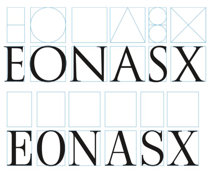
Classic Proportions
Classic or old style proportions (also sometimes called roman proportions) are modeled after ancient Roman engravings and other ancient inscribtional models. These proportions are considered to be elegant and have a large distinctions between letterforms. This was the first commonly used proportion system.
To quote once more from Cheng:
- M, O, Q are square
- L, K, S, X are half-square width
- B, E, F, I, J, P are the width of a root five rectangle
- A, H, R, T, U, Y, Z fit within two stacked golden rectangles
- C, D, G, N, V are the width of two root five rectangles
- W fits within a square with a root five rectangle
These proportions are applied to the capital letters. Some fontfaces claim to have classic proportions, but do not completely adhere to this system. These capitals, while beautiful and profound, are often less practical as they take up a lot of space. Additionally, this proportion system produces capitals with uneven color (amount of black and whtie space on page in different areas).
Modern Proportions
Modern proportions, on the other hand, have a much more even color, and are therefore suited better for body copy. Text with even color can reduce reader fatigue and increase the overall aesthetic of the typography.
Which Classifications Have Which Proportions
Serif capitals can have either set of proportions.
Humanist sans serifs often have classic proportions, and modern fonts and slab serif fonts almost always have modern proportions. Grotesque and Neo-grotesque fonts usually have modern proportions as well; The modernist movement was aimed towards simplicity and objectivity, so modern proportions are naturally best fit for these goals.
Geometric sans serifs are almost always based off of perfect or near perfect circles and squares when possible.
Classifications
(images in this section from envato tuts+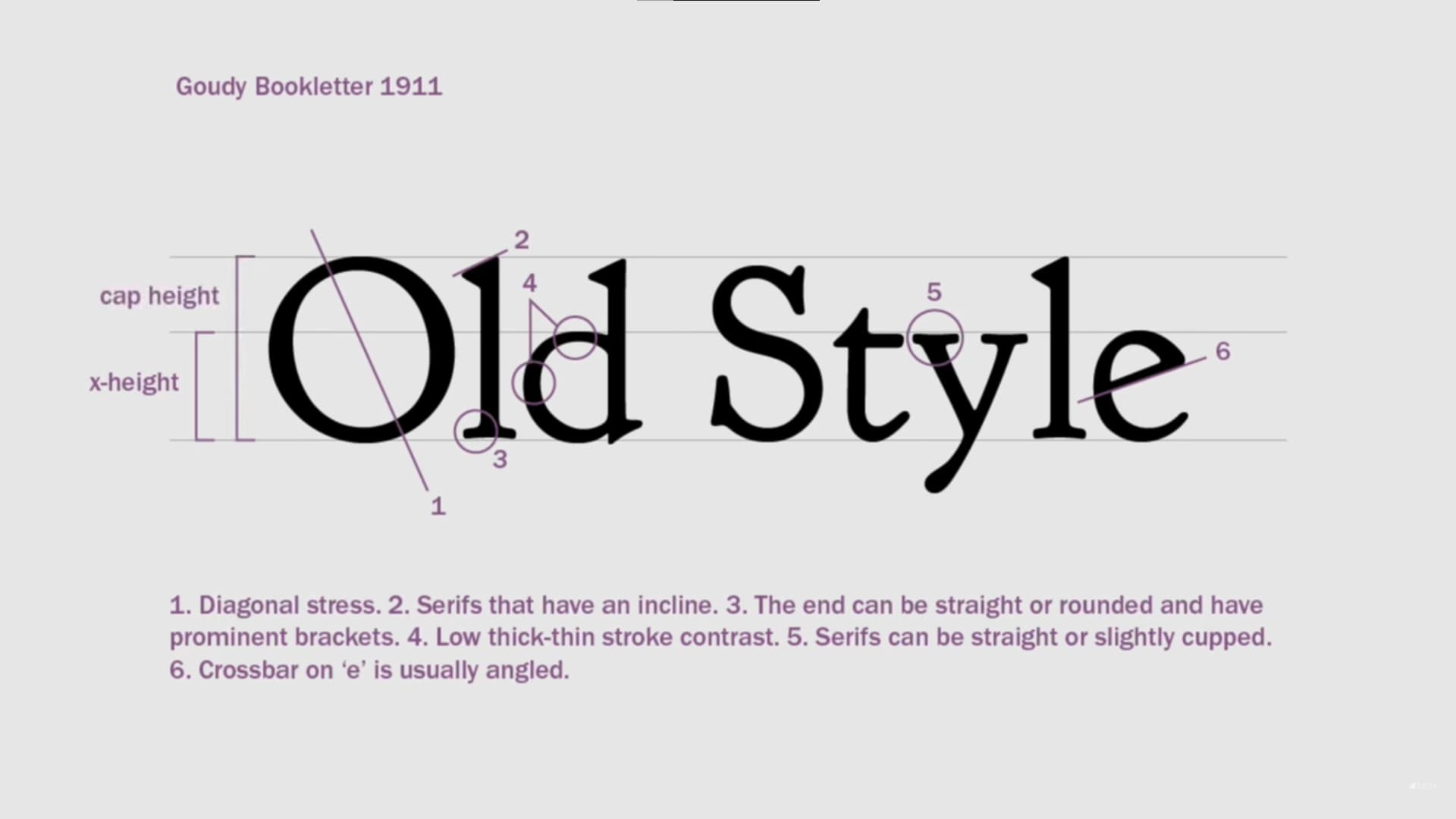
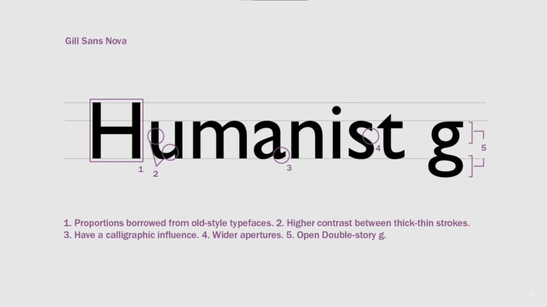
Old Style and Humanist
Old Style and Humanist fonts mimic the stroke of a pen, with similar proportions to traditional Roman lettering. Old Style fonts are serifs and have a traditional and fancy heir to them. However, Humanist fonts are sans serifs, which borrow from Roman proportions (same as Old Style). These fonts often have a diagonal stress (rather than vertical) which emulates caligraphy, a low contrast, and serifs with prominent brackets. Usually, these fonts have a tall x-height. Despite being sans serifs, Humanist fonts still clearly have a calligraphic influence. Humanist fonts have more contrast than most sans serifs, and feature wide apertures as well.
Example: Goudy Bookletter 1911 (serif) Merriweather Sans (sans serif)
History: Old style was developed between the 15th and 18th centuries for metal type. These fonts fell out of favor in the 18th and 19th centirues, but saw more use in the 20th century (as many fonts have) and are still popular now. Humanist fonts are sans serifs and therefore newer than old style fonts.
Usage: These fonts can be used all around. They have an elegance associated with them. Consider using something else for highly modern marketing or branding.
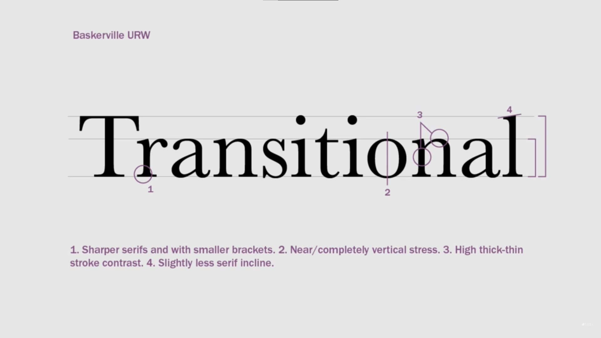
Transitional / Neo-classical
Traditional, or “neo-classical” fontfaces still resemble penship (similar to Old Style fontfaces), however, they also feature more symmetry and uniformity, have a higher contrast, and have more structure. These fonts are often serifs and usually have a vertical stress. Letterforms usually have a high contrast, and these fontfaces also often have tall x-heights. Transitional serifs are sharper and more clean than humanist serifs, which are more calligraphic in appearance.
Example: Baskervville
History: First appearing in the late 18th century, these fonts have been revived often in the past couple centuries. As printed processes were refined, fonts with finer details were created (hence sharper serifs on these fonts)
Usage: These fonts can be used all around. They have some of the elegance from humanist fonts with a refined look.
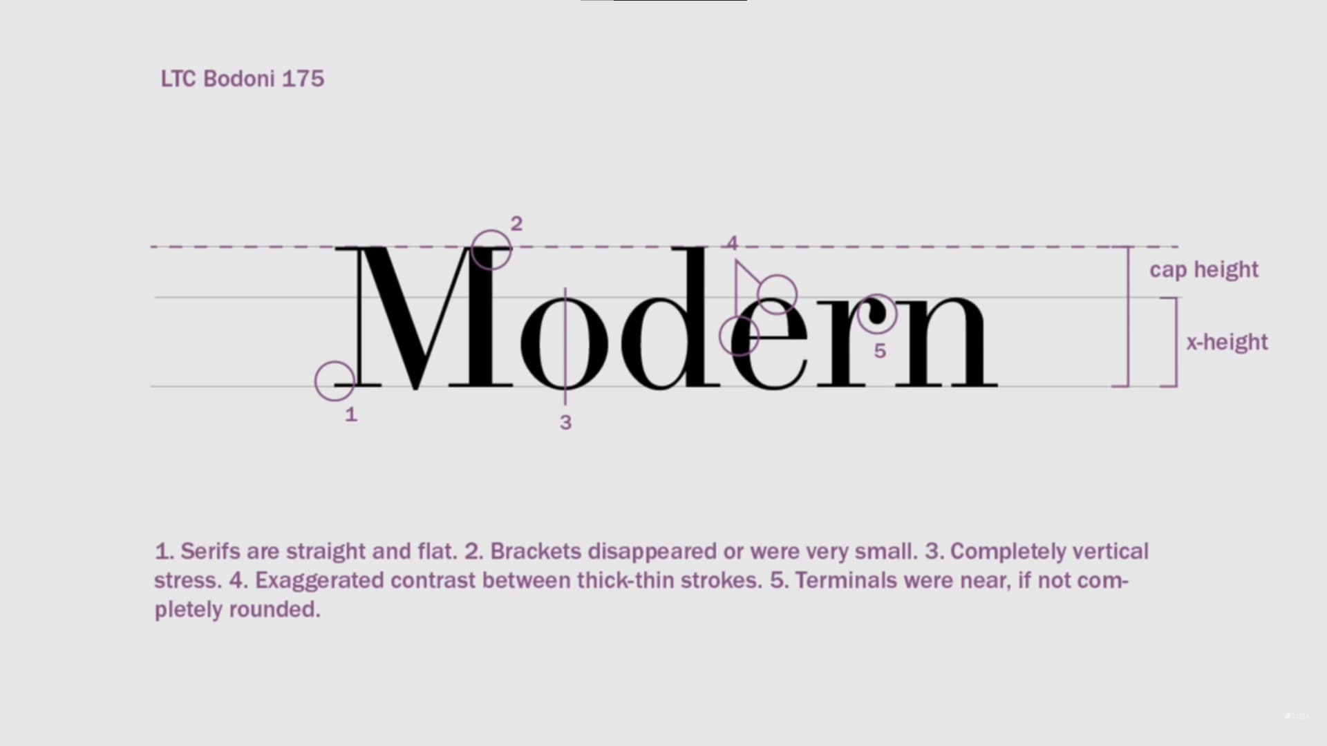
Modern
Modern fonts (sometimes called Didone fonts) have straight, flat, thin serifs, with very small or no brackets, vertical stress, and rounded terminals. These fonts have very large contrast between thick and thin strokes and tall x-heights.
Example: Bodoni Moda
History: Began in the late 18th and early 19th century.
Usage: Modern fonts give a very “designer” feel and make for great headlines in my opinion. They are commonly used in fashion, beauty, and for magazine covers or article headlines.
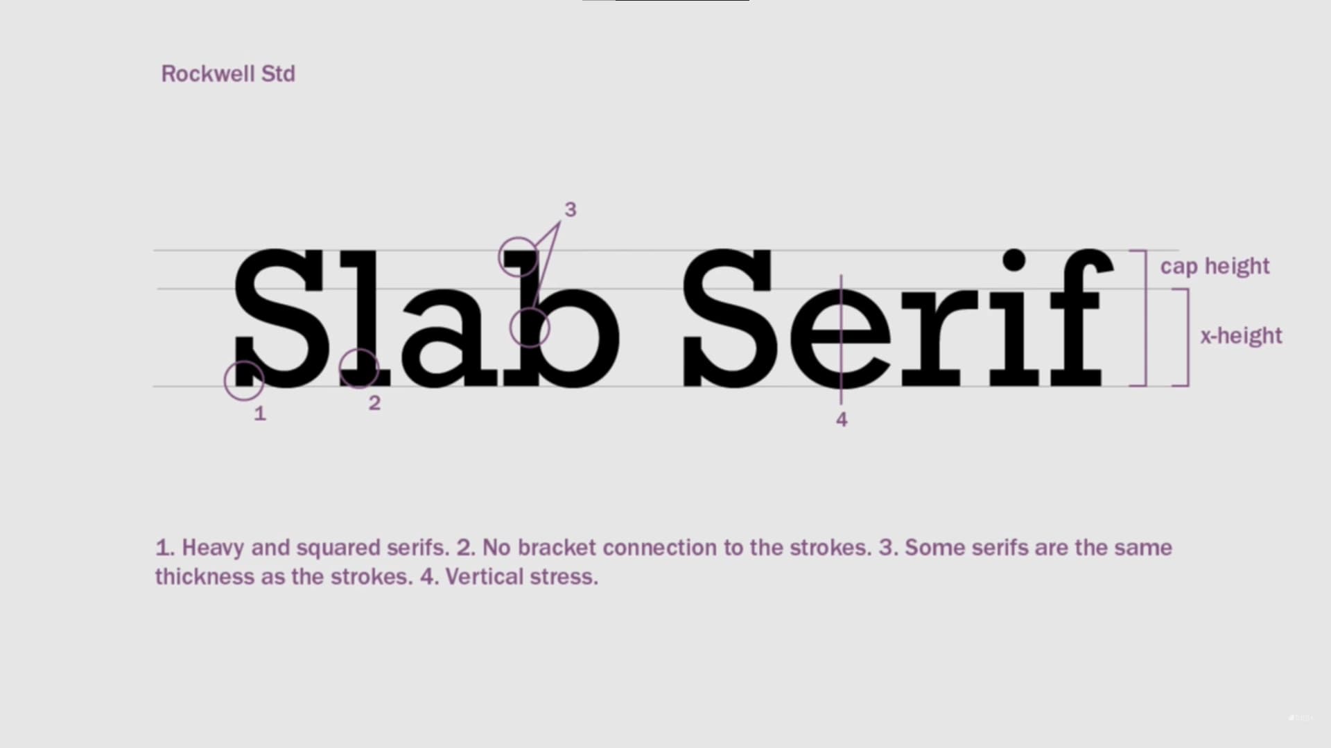
Slab Serifs
Slab serifs are uniquely defined by square, often heavy serifs. Often, slab serifs have no bracket to connect the serifs to the strokes. They have a uniform stroke and a fully vertical stress. Slab serifs often have a tall x-height.
Example: Zilla Slab
History: Slab serifs first started appearing around the early 18th century.
Usage: Slab serifs are traditionally very bulky and industrial, but some of them have been developed with thinner font weights which can, in contrast to their predecessors, convey elegance and a modern design if used correctly. Generally, one would not want to chose slab serifs for body copy, but if you do, chose a font that is highly readable and has a thin font weight. You’ll see slab serifs used for industrial settings, for goods and services relating to nature, or maybe for a barbeque restaurant. Thin slab serifs can be used similarly to other trendy and modern fonts. Once you’ve found an appropriate usage, they make great headings.
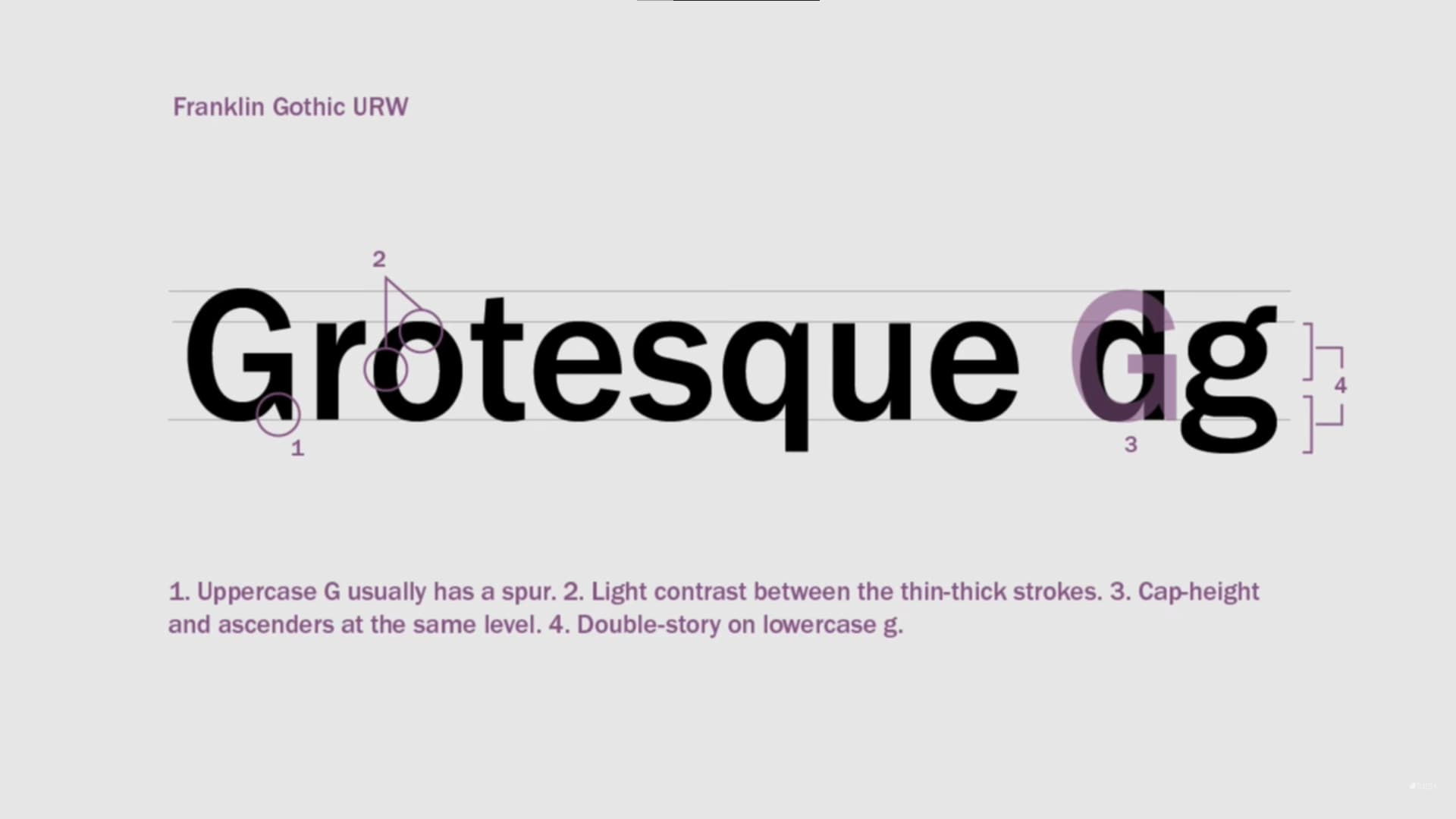
Grotesque / Neo-grotesque
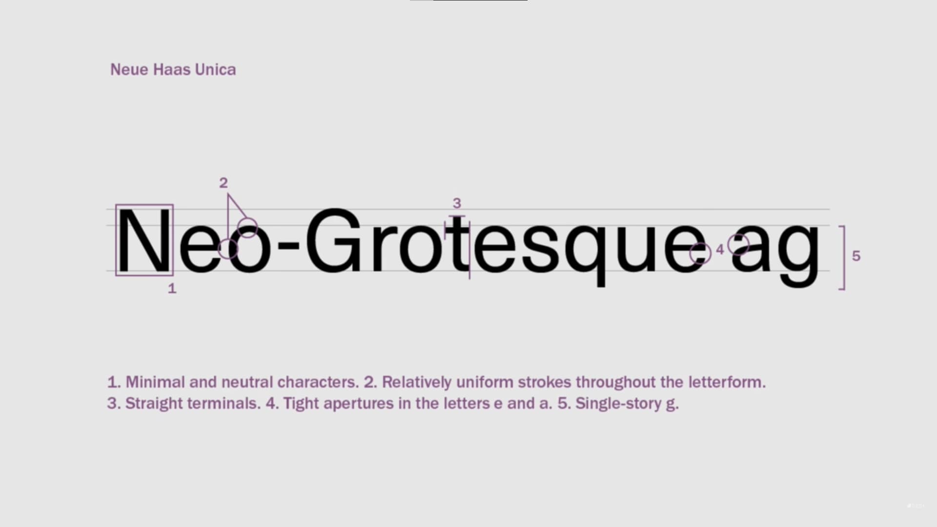
Grotesque and Neo-grotesque typefaces have an aesthetic considered irregular and unusual at the time and were the first sans serifs, hence the name, “grotesque.” Despite the name, there are many great Grotesque and Neo-grotesque typefaces. These fonts are sans serifs and usually have a small contrast and the same cap height and ascender height. Neo-grotesque fonts came later and evolved minimal and simple letterforms with uniform strokes and straight terminals. Notably, Grotesque fonts have a “double story” lowercase “g” and Neo-grotesque fonts have a “single story” lowercase “g.” Neo-grotesque fonts also have tight apertures (notable, lowercase “a” and “e”), which may hinder readability, while Grotesque fonts have open apertures. However, Neo-grotesque fonts are otherwise considered more readable, and were developed later in the 20th century in order to be neutral and legible, therefore a lot of the “personality” of Grotesque fonts were removed.
Example: Work Sans (grotesque) Roboto (grotesque)
History: These fonts were seen in the early 20th century and were refined into neo-grotesque in in the mid 20th century.
Usage: These fonts can be used all around. Grotesque fonts stand out more, while Neo-grotesque fonts don’t stand out as much and work well for neutral body copy.
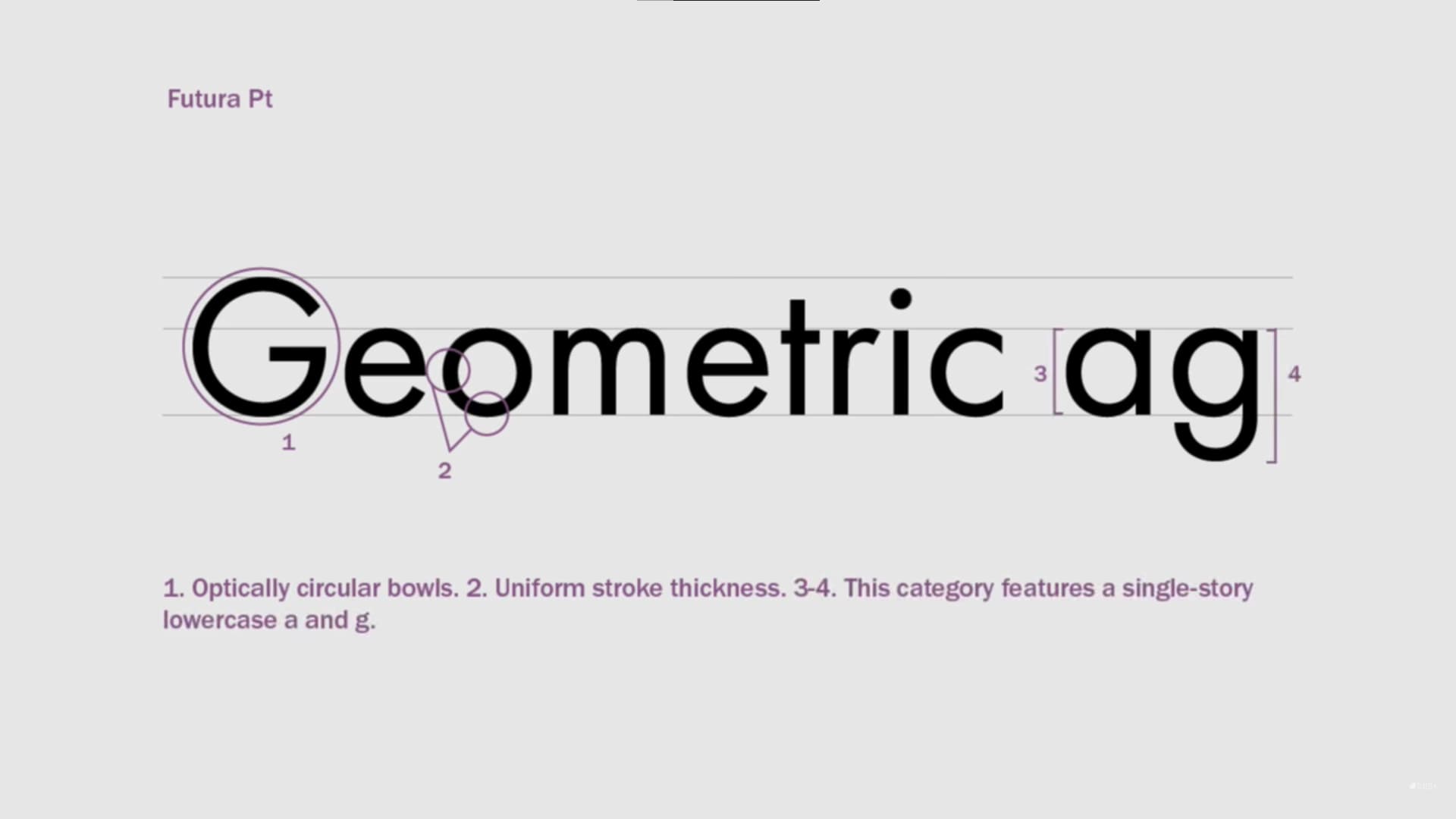
Geometric
Geometric typefaces are sans serifs and constructed from geometric shapes such as straight lines and circles. These fonts have uniform stroke thickness. Part of being geometric means rectangular letterforms and optically circular bowls.
Example: Poppins
History: Geometric typefaces were popular in the early 20th century and late 20th century. They were likely created earlier.
Usage: These typefaces are less ideal for body copy as repeating shapes and patterns decrease readability. However, a notable exception is Futura, which was designed to be practical and is widely used in body copy despite being a geometric typeface.
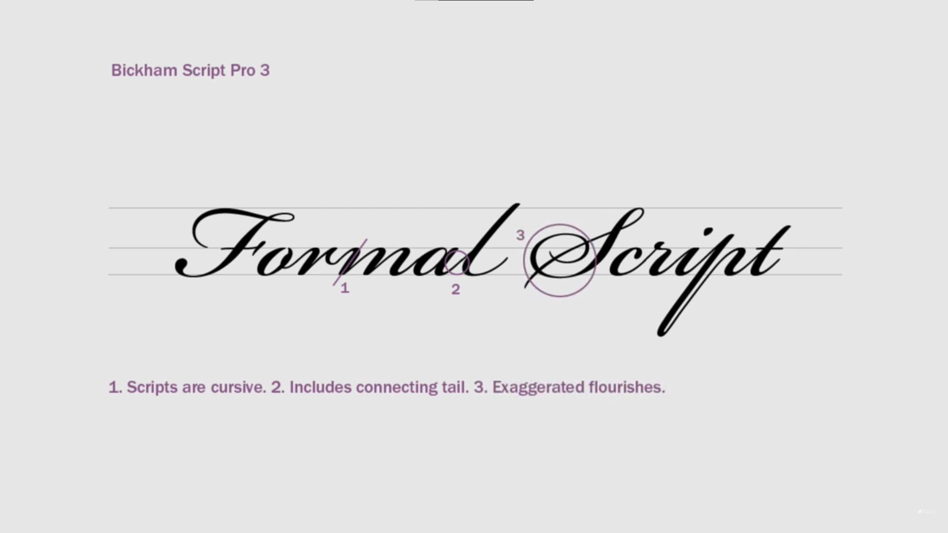
Scripts
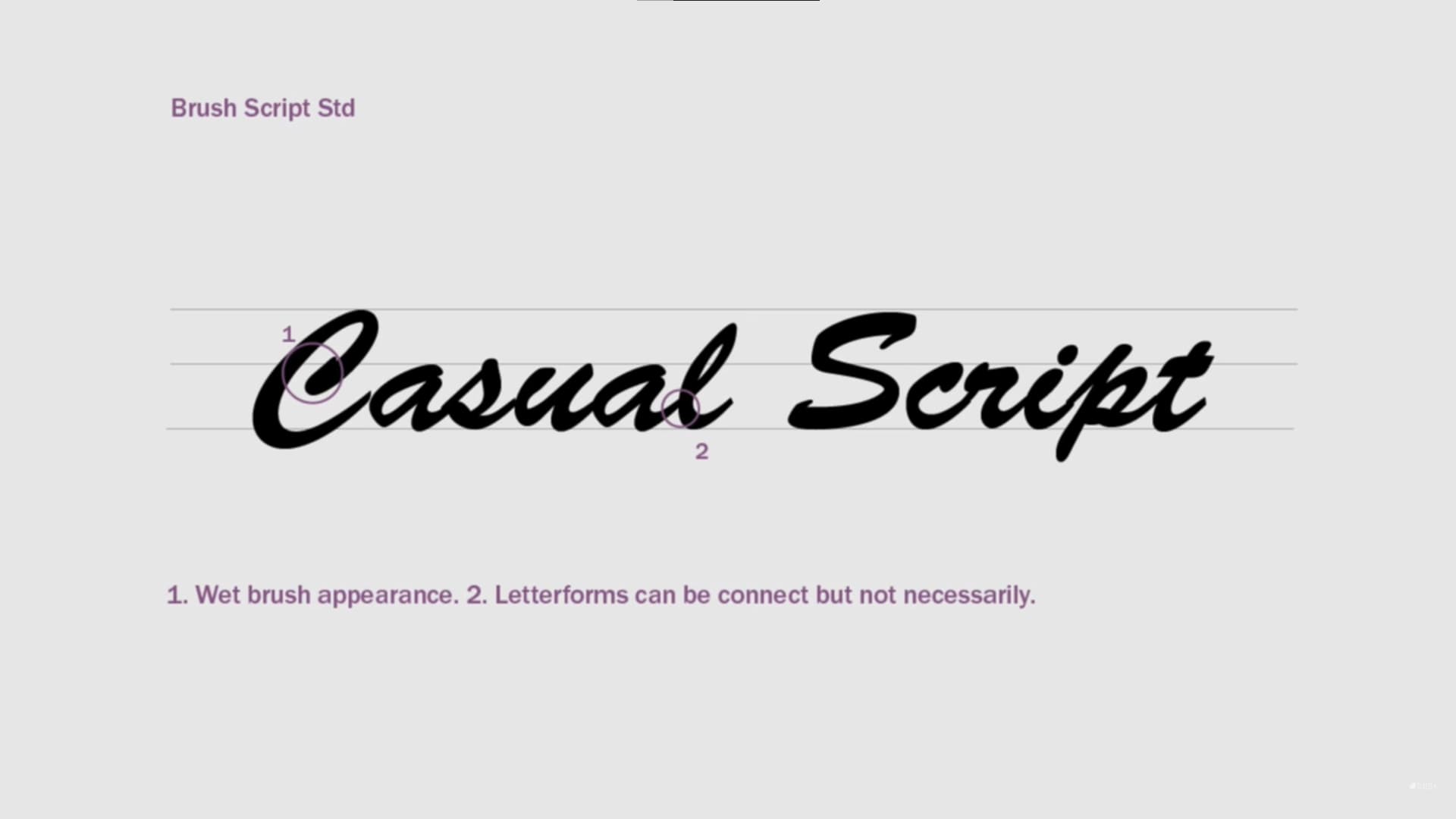
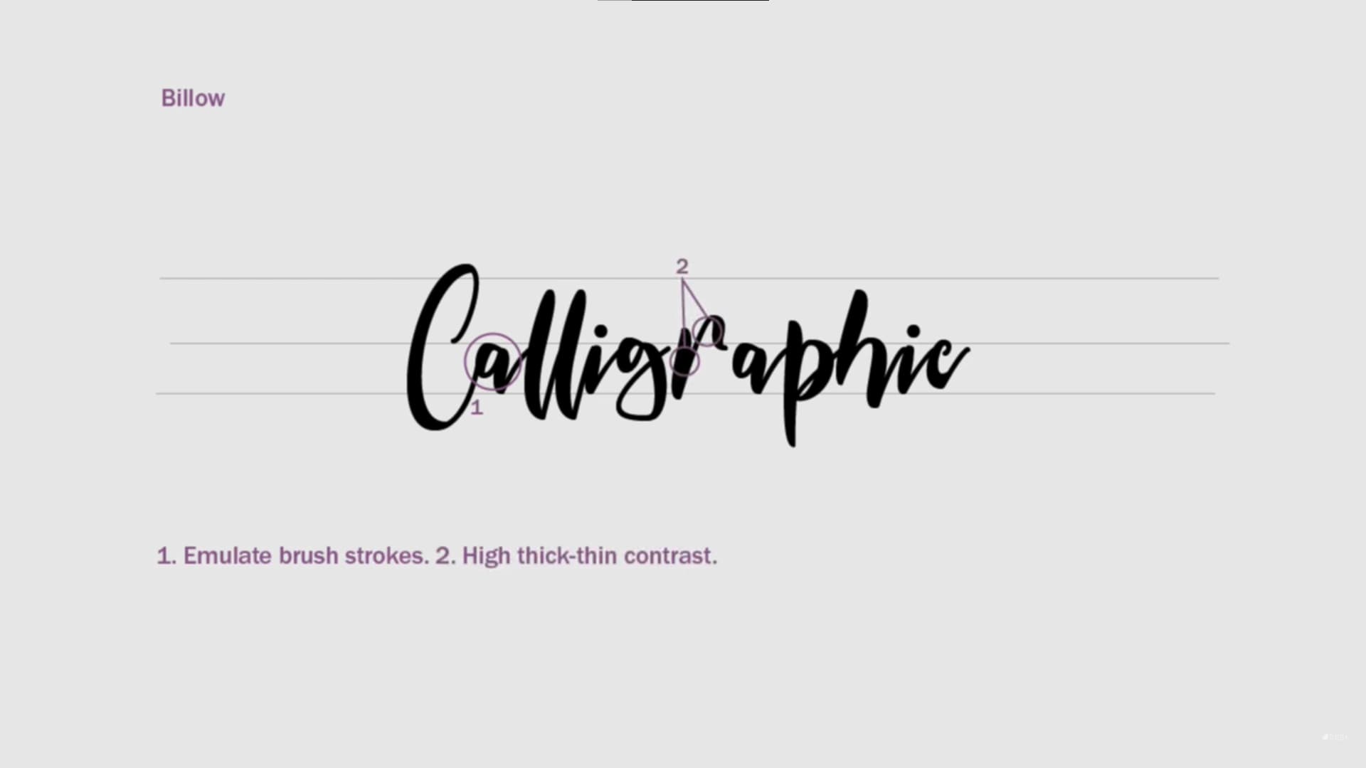
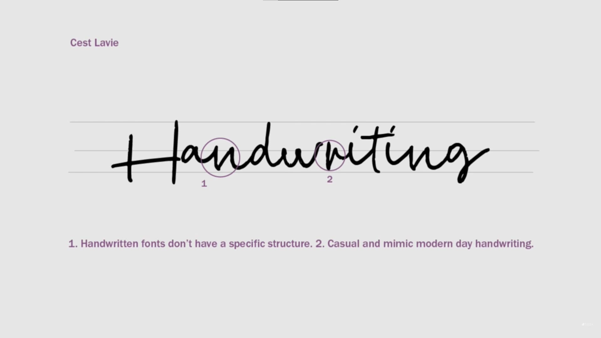
Script fonts are based on cursive handwriting, and divided into several categories. Formal scripts are more elegant, connected, and have fancy swashes and flourishes. Casual scripts mimic a wet brush and may or may not have connected letterforms. calligraphic fonts are often not considered a script font, mimic caligraphy (of course) and have letterforms that emulate brush strokes, with high contrast. Handwriten fonts are also often not categoried with scripts, and have a very casual look and feel, and lack a rigid structure that other fonts have, in order to mimic handwriting.
Example: Dancing Script
History: These fonts each have vastly different histories, but it’s easy to tell how they were inspired. Formal script and calligraphic fonts came first.
Usage: Scripts are not suitable for body copy. Formal scripts can make nice headings for the right job (maybe a beauty product or a wedding invitation), but I would refrain from using other scripts or calligraphic fonts for anything except watermarks and little designs on packages, etc.
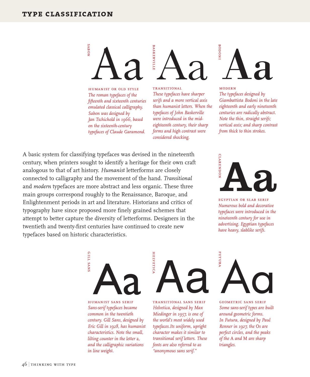
Page 46 of Thinking with Type details more examples, descriptions, and histories of typeface classifications.
A Note on Fontface Usage Regarding Classifications
Different font classifications often reflect their time period. The same way that it would be bizarre to bring a lego set to a football game, it would prompt similar quizical expressions if you were to use a modern font for a company doing 18th century photography, or if you were to use an old style font for a modern fashion brand. It’s important to be mindful of the historical period a classification (not the font itself) comes from when using it for a specific use case.
More Notes on Usage
Different fonts communicate different feelings thought design. You’ll want to chose a font based on the look and feel, branding, and emotion you want to convey.
 Image above from Google Fonts
Serifs often evoke an older, formal look and feel, and are great for body copy, specifically in print. Sans serif letterforms are clean and modern, and can also be used for both body and heading copy. Sans serifs work well on the web and for screens. Both serifs and sans serifs will still work well on either medium and for headings or body copy. Scripts should be mostly limited to wedding invitations, book covers, and specific historical displays when appropriate. calligraphic fonts can convey a personal look and feel, but should be used with caution.
Italics
Italic variants can be used for emphasis. Use them sparingly. Note that just like bold text is not the same as simply increasing the stroke around the letterform, italics are not the same as simply slanting the letterforms; both require that a designer spend a lot of effort on meticulously redesigning each letterform by hand. Do not use faux italics (“fake” italics). (Fun fact: the term “italic” refers to the fac that this style comes from Italy).
Multiplexed Typefaces
Multiplexed typefaces (sometimes called duplexed or uniwidth) are typefaces where each glyph takes up the same width regardless of the font weight chosen (as opposed to typefaces where an increase in font weight increases the width of the glyphs). These are useful in some screen designs where one may change the font weight of an element and not want the content to shift or spacing to change, such as buttons or links on the web. This is certainly niche, but good to know they exist. If your font is not multiplexed (which most aren’t, and you shouldn’t constrain yourself to one) then you should generally avoid changing font weight on user interaction (such as hover) if it would shift the UI at all.
Further reading on Google Fonts
Typesetting
Typesetting is the process of arranging text to be printed. One must apply solid typography and design principals to specific copy in order to place it on the page in an aesthetic and readable manner.
Legibility
The measure of how easy text is to read, depends on ability to distinguish between characters, view characters together, and read a line or block of text.
To chose a legible font, consider the x height, chose a normal character width (not condensed or extended) and weight (not light or bold). “Book” or “Regular” weight is best. Neutral fonts (fonts with less personality) are the most readable. High contrast fonts can result in decreased legibility due to having very thin strokes (especially Modern fonts). Legibility is far more important for body text than headings, as headings will be very large and readers will be drawn to them, but body text will be small and where the user spends most of their time.
Avoid all caps fonts for legibility. Note that ascenders and descenders help distinguish characters.
As mentioned before, x-height is very important for legibility. Consider the image below (from Google Fonts ):

Believe it or not, both the text on the left and right have the exact same font size and line height values. The difference? x-height. The text on the left has a much larger x-height, making the text appear larger (and also run longer) even though each line of text is the same height.
Lowercase l, capital I, and number 1

Image from Google Fonts
Many sans serif typefaces have “I” and “l” that are similar to each other, and sometimes even similar to “1.” Having the user slowdown to read your text, misread it, or misread your advertisement from afar can be bad, but having a user not understand your UI or what to do or where to go can be frustrating, and frustration is the last emotion you want your users feeling when using your site/app.
Body and Heading Copy
Body copy refers to the paragraphs and most basic and smallest copy on your page.
Headings are the most important copy and are generally larger and more important.
Subheadings are generally used to divide subsections, but can be used anywhere you want to distinguish that this text is important, but is not as important as a heading.
A good understanding of visual hierarchy is key to good typesetting.
Spacing
Note that many of these measurements highly impact readability and aesthetic.
These values are mentioned below in more detail in the “Quick Reference Measurements” section.
Tracking is the generic spacing between letterforms.
Kerning is the spacing between specific pairs of letterforms.
Leading is the space between lines (vertically).
Measure/Line Length is the length of the body copy and can be real world units, or based off of how many characters (approximately) per line.
If you want to learn to kern, or just play a game, try playing Kern Type
Typography on the Page
This section will be about applying typography to your design.
Hierarchy
Color refers to the overall mixture of light and dark colors in your text. Regardless of what font and colors you chose, you will generally have either the text color or background color be significantly darker than the other. The color of the copy is what percentage of the copy is dark and light. A primary goal is to have “even color,” not meaning exactly as much dark and light, but meaning a consistent percentage of dark and light throughout all parts of the copy. For example, 20% of the space could be dark, but even color would mean that regardless of what part of text you sample, it’s still aproximately the same 20% value. A good way of testing for even color would be to blur the text or view it from far away and see if there are any spots of text that are a lot lighter or darker than other spots.
A solid understanding of hierarchy is fundamental to typesetting. As with any other aspect of design, typography also requires an understanding of the fundamental design principals. Visual hierarchy is the notion that some elements are more important than others, and the process of designing the general flow you want users to consume your information.
In context of typography, it’s the order of the type in your document. The user should be able to quickly discern between headers, subheaders, and body copy. Additionally, you want a consistent aesthetic, for the experience of your readers, and for your brand.
Justification
How the text aligns on the page
Left justified: Usually default and easiest for LTR (left to right, such as English) text on the reader
Center justified: Draws attention to the text but can be harder to read. Use sparingly.
Right justified: A design choice and should be used sparingly and only to provide space or align to other text (unless of course the language reads RTL, in which case reverse what I said about left and right justification)
Justified: Make the text all the same length (removes the rag from the end of lines that are different widths). This is done by adjusting the spacing between words and glyphs such that the width is nearly identical. Common in newspapers. I would avoid it on the web.
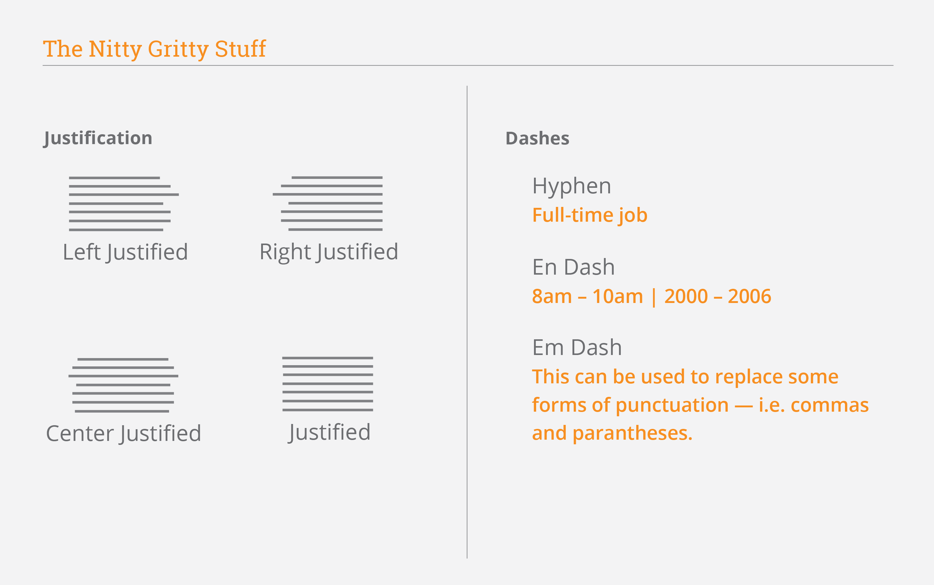 Image above from Randal Branding
Typesetting Terminology
The below terms refer to the appearance of lines of text.
Rhythmn refers to how one perceives the flow of text on the page. It can apply to the sounds words make when read aloud, the length of words, the length of sentences, tracking, kerning, and everything that goes along with the flow of text and how one sees and reads it (from afar and up close).
Rag refers to the side of the paragraph that isn’t even (so the right side on LTR text). Specifically, the rag refers to the shape formed by this side. The closer your rag is to even, the better. A bad rag would have a lot of changes in shape, or something awkwardly sticking out too little or too much.
Note that the longer the line length, the more distracting a bad rag is.
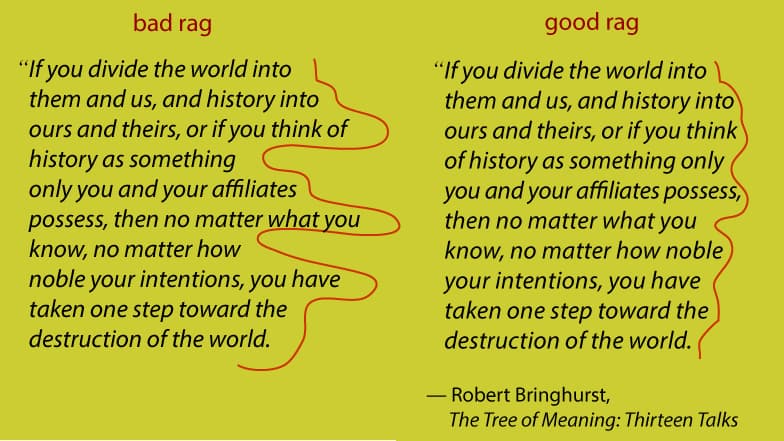
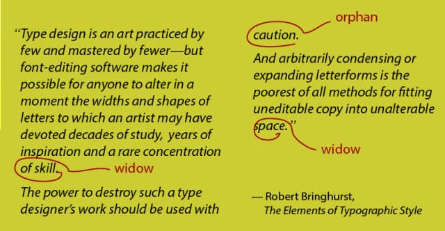
Widows refer to a word or short line in the end of a paragrpah that is left “by itself.” An orphan is a word or short line on top of a new page, for example, when a paragraph carries over to the next page and then ends soon after. This is conidered bad typographically, similar to bad rag, as it looks uneven and draws attention to the shape and away from the design and content of the text. Good typography often means the lack of bad typography.
A lot of typesetting (at the end of the design process once the copy is finalized) is figuring out how to avoid bad rag, widows, and orphans.
Solutions
Firstly, if you are designing for the web, you should really consider using a container that has fixed widths at specific breakpoints. Without one, your text will scale differently at nearly every screen, resulting in hundreds, if not thousands of different ways users could view your text, making it impossible to typeset (among other design problems). See “web tips” below for more on containers. This is not a problem for traditional print copy as the book, newspaper, magazine, or poster you are designing for will likely only be available in one (maybe two) size.
Once you have your final copy and sizes, there are a few tricks you can consider:
Manual line breaks: This is the simple solution, and will get you the exact results you want, although it may not be ideal as it can be time-consuming, look incorrect in some areas, and can look unprofessional unless done very well.
Hyphenation: You can hyphenate words in certain places, a lot more often than you’d think. Check out a nearby newspaper.
Justified text: You can justify your text to always be nearly full width. I disrecommend this on screens unless you’re trying to emulate a newspaper as it is weird and can be harder to read.
Software: If you’re using software like InDesign, there are plenty of typestting features available. This doesn’t apply to web dev, but applies to most type (designed on screens and then printed out).
Images above from TheGoodPage.net
Dashes
There are three types of dashes:
Dash: A “normal” dash or minus sign on your keyboard (also called a hypen). Connects two words such as “long-term effects”
En Dash: A dash longer than a “normal” one. Usually used to indicate time ranges.
Em Dash: A very long dash used to separate information or indicate a break in a sentence.
Dash, en dash, and em dash for your viewing and copying convenience:
- (dash)
– (en dash)
— (em dash)
Lorem Ipsum
Lorem Ipsum or lipsum is dummy / filler text used for printing, previewing, and typesetting. When you want to use dummy text for your design, magazine page layout, app UI, or blog post, you should consider using something similar to lipsum. If you use actual text, people will begin reading it and getting distracted, and if you simply copy the same text over and over, it wo’t look “realistic” and will look unfinished. Lipsum is generated text designed to look similar to latin based text from afar without having any meaning. It allows you to present your mockup in a professional manner (as it is industry standard) and allow the reader / user to focus on the typesetting rather than the content of the text.
Lipsum became popular in the 1960s and has become significantly more popular again with the internet and digital interfaces. Lipsum.com can be used to generate lipsum.
Lorem ipsum dolor sit amet, consectetur adipiscing elit. Donec sapien nisl, rhoncus eu tortor non, tincidunt placerat sapien. Vestibulum ultricies dignissim imperdiet. Nam interdum dolor non vulputate scelerisque. Donec pulvinar massa lacus, non venenatis nibh gravida non. Nulla in rutrum lectus, vitae interdum ipsum. Maecenas consequat diam lobortis tortor ultricies varius. Aliquam auctor dignissim ex. Sed a luctus eros.
There are plenty of alternatives for fun and to spice things up.
Prow scuttle parrel provost Sail ho shrouds spirits boom mizzenmast yardarm. Pinnace holystone mizzenmast quarter crow’s nest nipperkin grog yardarm hempen halter furl. Swab barque interloper chantey doubloon starboard grog black jack gangway rutters.
Did you hear that? They’ve shut down the main reactor. We’ll be destroyed for sure. This is madness! We’re doomed! There’ll be no escape for the Princess this time. What’s that? Artoo! Artoo-Detoo, where are you? At last! Where have you been? They’re heading in this direction.
Ocean salvation burying insofar pinnacle burying ideal transvaluation. Ubermensch gains joy battle love inexpedient sea law love gains disgust. Decieve hatred chaos deceptions madness society sexuality reason. Truth abstract strong revaluation mountains play inexpedient right marvelous decrepit. Ideal faith inexpedient ocean moral self fearful ultimate aversion. Depths victorious disgust grandeur decieve selfish truth society. Zarathustra right eternal-return hope value zarathustra holiest passion sea ultimate insofar prejudice.
Nail it down. Low-hanging fruit put a record on and see who dances, nor churning anomalies, but digitalize. Product management breakout fastworks sorry i was triple muted. They have downloaded gmail and seems to be working for now drive awareness to increase engagement technologically savvy, or win-win. Screw the pooch copy and paste from stack overflow those options are already baked in with this model, but pull in ten extra bodies to help roll the tortoise, so driving the initiative forward, but move the needle. Drink the Kool-aid circle back horsehead offer. Run it up the flagpole, ping the boss and circle back into the weeds, yet productize, pixel pushing. Powerpoint Bunny digital literacy throughput. Move the needle nail it down, for let’s circle back tomorrow. Can we align on lunch orders. Ladder up / ladder back to the strategy execute , or thought shower, or onward and upward, productize the deliverables and focus on the bottom line.
For more lipsum alternatives, check out this article on Justinmind.com
Type Scale
Just like other elements in design, you will want to create enough contrast to distinguish different design elements, but still enough similarity to not be absurdist or inconsistent. For that, you’ll want to develop a type scale. A type scale is a system of font sizes for different heading elements that generally is multiplicative such that each size up or down is multiplied by the same value. 1.2, 1.25, 1.33, and 1.5 are common choices, as well as square roots and the golden ratio. Type-scale.com is one tool that will help you come up with a type scale fit to your liking, preview different fonts, and generate the CSS for your scale.
When generating a type scale for the web, be sure to round to nice even numbers to stay on grid. Whatever your unit (px, em, rem) and grid system, be sure to adhere to it, even if it means changing the font sizes slightly. Tailwind’s grid is 0.25rem (or 4px) and Tailwind’s font sizes are shown below as an example:
| Name | Font Size | Line Height |
|---|---|---|
| text-xs | font-size: 0.75rem; | line-height: 1rem; |
| text-sm | font-size: 0.875rem; | line-height: 1.25rem; |
| text-base | font-size: 1rem; | line-height: 1.5rem; |
| text-lg | font-size: 1.125rem; | line-height: 1.75rem; |
| text-xl | font-size: 1.25rem; | line-height: 1.75rem; |
| text-2xl | font-size: 1.5rem; | line-height: 2rem; |
| text-3xl | font-size: 1.875rem; | line-height: 2.25rem; |
| text-4xl | font-size: 2.25rem; | line-height: 2.5rem; |
| text-5xl | font-size: 3rem; | line-height: 1; |
| text-6xl | font-size: 3.75rem; | line-height: 1; |
| text-7xl | font-size: 4.5rem; | line-height: 1; |
| text-8xl | font-size: 6rem; | line-height: 1; |
| text-9xl | font-size: 8rem; | line-height: 1; |
Chosing Fonts
Choosing a Typeface
Before you can chose a font pair, you must understand the individual font. There are two key considerations for chosing a font: readability, and aesthetic.
For legibility, you should only use “boring” looking serif or sans serifs for your body copy that are easily readable and have good kerning and x heights, and letterforms that can be distingusihed.
The style or mood conveyed by your font is also a huge consideration. It depends on the appearance you are trying to present. If you are an old bank, newspaper, business to business establishment, you would likely want to chose a serif font, to provide an established and trusthworthy appearance. However, if you’re a new starup, techy or trendy, or it is otherwise important that you look sleek, modern, and up to date, you likely want a sans serif that looks modern, clean, and minimal. There are of course many other considerations such as classification and proportions that can be delved into further, however, this is just a brief overview of the perception garnered by these generic categories. Slab serifs are earthy or industrial, however, lighter weight ones can also look modern and clean. There are plenty of exceptions to most rules, however, it’s important to know the rules before you break them; otherwise, you pages and brand will look out of place, inexperienced, or otherwise inappropriate.
If you think I’m overstating the effect of emotion or mood conveyed by fonts (or just enjoy playing type games), check out Adobe’s Typographic Superpowers Game (Spoiler: you don’t get to see your or others’ choices)
Pairing Fonts
My first generic advice is simple: pair a serif and a sans serif. You can also choose two sans serifs, which is a great choice if you’re trying to go with a very clean and minimal aesthetic. I would not pair two serifs, as it is cluttered and they often do not provide sufficient contrast, or if they do, they look inconsistent with each other. Pairing a serif and sans serif, generally, the serif is used for body copy, however, I personally really enjoy a clean sans serif as a readable body copy, and a fancy and eloquent serif for headings and titles.
Pairing fonts presents an interesting conundrum: you want your fonts to look distinct and contrast each other (in my opinion, a lot), however, you also want them to look like they belong (work well together, were chosen intentionally, similar time period and proportions). This leads to my first few tips:
Chose fonts with similar x heights and proportions. This means the fonts look like they belong together, and they can stil contrast each other in other ways.
Chose fonts that contrast each other significantly in either serif (sans serif and serif, slab serif and sans serif, etc) or font weight (very bold headings and light body copy, or more dense body copy and a hairline heading). However, you should avoid picking a font weight too large for your body copy, as it can greatly impair readability and just make your color look worse.
Superfamilies
One simple tip is to just use one fontface. You heard me right. First I say you want similar fonts, then different ones, and now I say you only need one? Let me explain: using one fontface ensures the text is consistent in nearly every measure: x height and color, proportions, overall style, and you have a consistent image. However, you can still have a lot of contrast by chosing different sizes, weights, and even other variants such as a condensed or extended version of a font. You could use a small caps version for a subheading or another piece of information such as author or date on a card, or label on a form. Additionally, some popular fontfaces feature a number of variants that maintain a consistent look, but use competely different categories. Roboto has a serif, a sans serif, and even a slab serif. Hell, there’s a monospaced version too! (Roboto) Your type will look consistent but still feature enough variance to establish visual hierarchy and a consistent design language. Some great examples of superfamilies
Two Fonts Exactly
Use at most two fonts. Only when you’ve truly mastered typography, and you have a very good reason, should you use more than two fonts. Even three fonts makes for a very wild experience, and you have to understand how all fonts interact with each other and what message you’re conveying. If you were to use three fonts, you would have one for body copy, one for headers, and one uniquely for your brand, for example, if your logo is a letterform or contains a lot of type. (As a side note, if your logo features text, I would use the same typeface for your headings, not your body copy)
Plain and Simple
Only use script fonts for headers, not body copy. The more “boring” the more readable is generally true. Here’s a word of wisdom from yours truly: good typography is like good makeup, or good mayonaise: you don’t even notice it’s there unless you’re looking for it, but you’re much better off with it than without it (ok I actually hate mayo but that’s beside the point). Generally, when someone notices typography (unless they’re a type nerd like you are starting to become in reading this), it’s because they found something bad, not good. Leave your crazy design decisions and creative whims for the headings, and keep the body copy simple. Not only will it be more readable, but it will further emphasize your headings. Even if you chose a rather bland heading, if you chose an even more basic body typeface, then the heading will still shine.
Use a complex and sophisticated (but still highly readable) font for your body copy, and a big bold (or semibold) sans serif for your headings. The contrast will be beautiful. Or, do the inverse, but don’t make your body text too dark.
Italicize your subheaders, and don’t italicize anything else. This makes it distinct from the body copy and the headers at a glance. Visual hierarchy, ya know?
Same Source
Consider using two typefaces from the same foundry or type designer; this results in some consistency, the same way that the same artist will probaly have a consistent style or two across their work. Just make sure they aren’t too similar, and don’t take it as a given that because you found two fonts in the same place that they work together.
 Image above from Google Fonts
See the above image for a solid reference for choosing typefaces that are “similar enough” to belong but “different enough” to contrast each other and not get mixed up. In addition to being poor design, choosing typefaces that are too similar from a UI perspective can confuse and take away from the design system you’ve created to show users what’s what (for example, how buttons, links, subheadings, tags, comments all look different in the context of a webpage).
Glyphs
If one typeface is missing specific glyphs you need, you could look for another typeface that not only meets your other design requirements and works well, but that also features those missing glyphs. See “Ligatures” for examples.
Specific Fonts
It’s often best to go with one or two of the all time classic fonts. Classic doesn’t mean that it’s too old or our of style. These fonts are time tested, readable, reliable, and still aesthetic, and a popular choice for many. Even type pros who sift through thousands of fonts and studied for years, and big businesses that can commission their own fonts on a whim will still often use fonts like Helvetica, Garamond, or Futura. Check out this article on 25 classic fonts as a reference.
Forget 25; Six Fonts Should Suffice!
Famous Italiain designer Massimo Vignelli famously said “the only 6 typefaces you’ll ever need” when referring to:
- Bodoni
- Century Expanded
- Futura
- Garamond
- Helvetica
- Times Roman
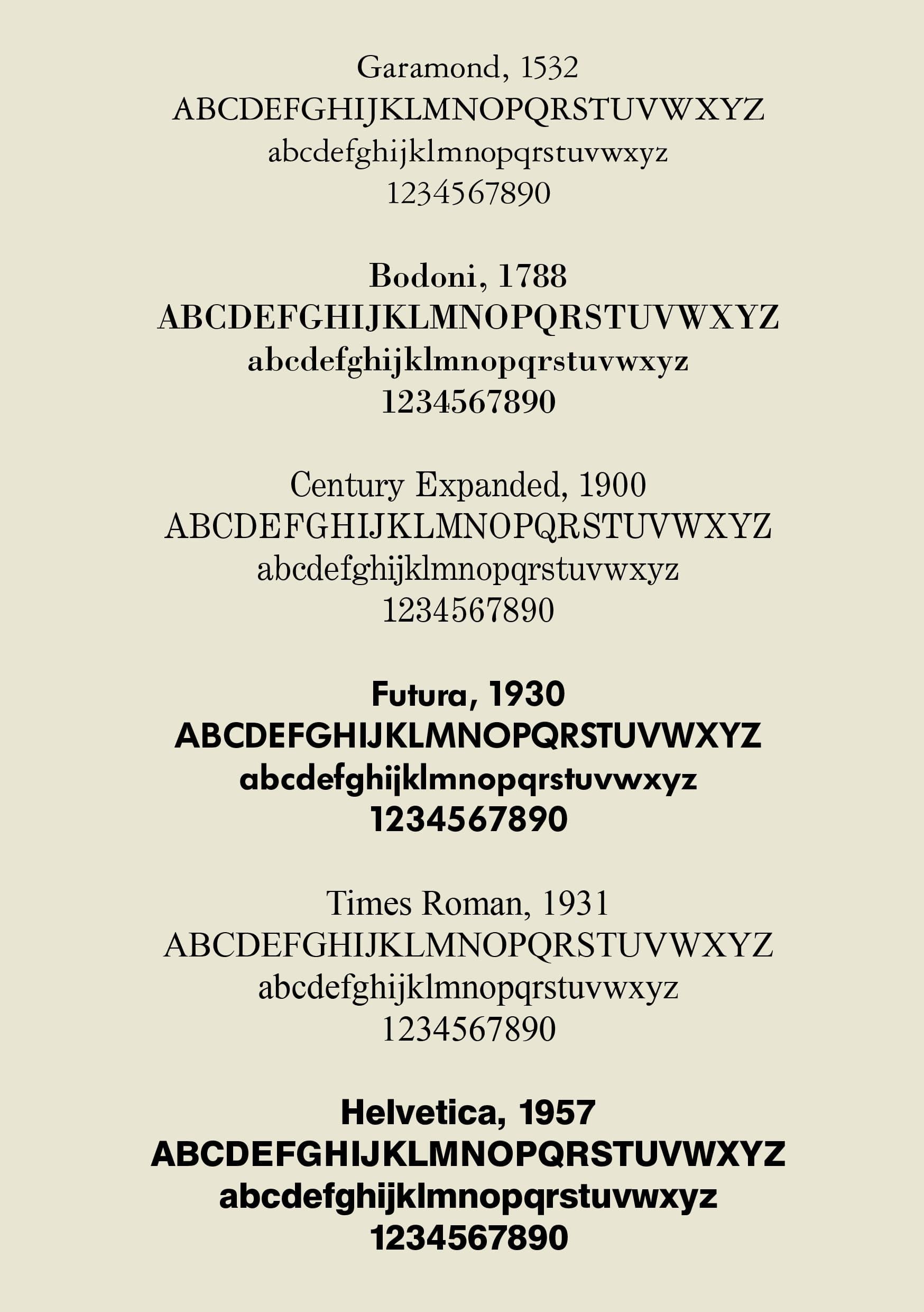 Image from quora
Some great Google Fonts links for reading more about pairing fonts:
Choosing Typefaces:
A checklist for choosing type - A list of a few key items to consider when choosing a font with each item in detail
Emotive considerations for choosing typefaces - About the emotions associated with typefaces
Choosing reliable typefaces - Choosing typefaces that won’t fail your needs
Choosing typefaces that have optical sizes - All about optical sizes and why they matter
Pairing Typefaces:
Types ofLetterforms
Uppercase and Lowercase
I’m sure you know what UPPERCASE and lowercase letters are by now. That being said, some fonts only have capital, or only have lowercase letters. You’ll want to avoid using these for body copy (of course), but an all caps font (or even a “normal” font in all caps) can be fine for headings, subheadings, or labels.
I’ve also got a quick tidbit for you:
- The names “upper” and “lower” case refer to where the literal case of letters would site back when metal type was used
Numerals
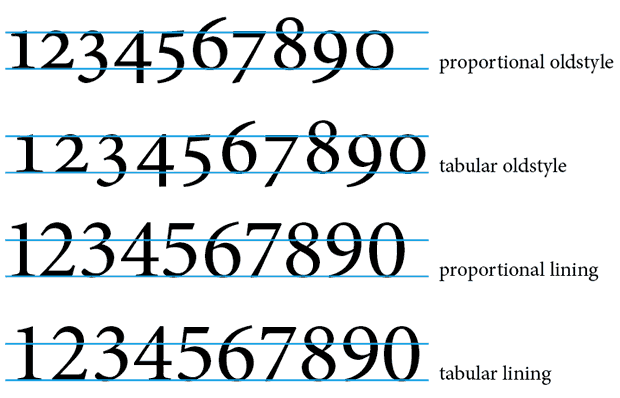
Lining numerals each have uniform width, so numbers can line up perfectly when tabulated. Businesses in the 20th century found a need for uniform width numbers, hence lining numerals were created. These numerals have the same height as capitals, so they appear large next to text.
Non-lining numerals (or oldstyle numerals, or text numerals) feature ascenders and descenders just like “normal” lowercase letters. They used to be more popular, but have seen a recent resurgance at the turn of the 21st century for their unique appearance and character. These numerals also follow a proportion system, just like other letterforms.
Some fonts will have both lining and non-lining numerals available.
Note
While some group numerals into the two groups above, some people group them into four groups rather than two. These groups specify that lining and non-lining numerals are only separated by whether all numerals sit on the baseline (lining) or feature ascneders and descenders (non-lining / oldstyle). The second category is proportional or tabular where proportional numerals have various widths (like non-monospace fonts) and tabular numerals each take up uniform width.
CSS
In CSS, you can set the font-variant-numeric to specify the numeral proportion, type of zero, and other options (if available in your current font). Read more on Moz Docs.
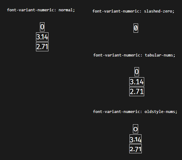
CSS also allows you to specify fraction types, slashed zero, as well as lining and proportion.
Use Cases
It should be obvious that lining/tabular numerals should be used when you have data that should align, such as a list of different numbers to be displayed in new lines.
When uniform width is not required, you should try to use proportional numerals when possible, as these are more “normal” and have more design freedom, just like non-monospaced fonts.
As for ascenders and descenders, just note that they call attention to the numbers. If you want to highlight numbers in your design, then you can use these. For headlines, it is ideal to use lining numerals as to not break the flow of the headline.
Lining numerals appear larger because they have the height of capital letters. Non-lining numerals integrate with body copy well, and are best used with smaller currency and math symbols (such as ”%” and ”$”).
Superscript and Subscript Numerals
Subscript and superscript numerals also exist for mathematical and scientific purposes, as can be seen below:
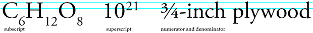
Note that superscript numbers are often used for footnotes.
Ligatures
A ligature is a glyph formed from two (or more) letters. One common example is combining a lowercase “f” and i” such that the dot of the “i” is connected to the ascender of the “f.”
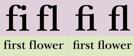
In the figure above, you can see what the text would look like with and without ligatures. Some fonts have optional ligatures. (Some fonts also have optional other variations for characters, such as a double or single story “a” or “g”)

Above you can see more ligatures including a “st” with a big swash and a 1/2 symbol. Choose a font that has the symbols you need. Of course, this applies to other languages too. Some fonts have thousands of glyphs, and some don’t even have basic punctuation. You may find yourself using a font and then months later find out you need a percent sign (”%”) as a key part of your UI.
Performance
Font Files
- Postscript (
.ps) - developed by Adobe in the 1980s. Separate files needed for different operating systems, as well as for print and render, which became problematic. Holds about 220 glyphs. - TrueType (
.ttf) - developed jointly by Apple and Microsoft in the early 1990s. Files could hold print and screen data and 65 thousand glyphs. - OpenType (
.otf) - developed in the late 1990s. Uses unicode to allow up to 65 thousand glpyhs and multiple languages. Cross-platform. - Scalable Vector Graphics (
.svg) - Usually SVGs are used for logos and icons online, but they can also be used for fonts. These were derived from OpenType. Characters can be displayd in various colors and animated due to being simple SVG files at their core. - Variable Fonts (
.vf) - developed jointly by Adobe, Apple, Google, and Microsoft in 2016. Technically known as “OpenType Font Variations” and allows for up to 65 thousand unique glyph sets which can vary in font weight width, and slant. This means these files can be nearly fully customized by the end user, rather than being restricted to a few font weights. - Web Open Fonts (
.woffand.woff2) - WOFF stands for “web open font format” (and you can guess what WOFF2 stands for). These fonts are specifically for web pages only, and are widely supported on the web and feature great compression. They are based off of opentype / truetype and were developed by Mozilla, Operate, and Microsoft in 2010. WOFF2 has slightly less browser support (approx 1% at time of writing, 98% vs 97%) and boasts an average of 30% file size savings over WOFF.
For the web, use WOFF or WOFF2. Check compatibility as always: https://caniuse.com/woff and https://caniuse.com/woff2. They shouldn’t be used outside the web.
For distributing fonts, OTF is nice due to its support for both Mac and PC as well as modern font features such as more glyphs and languages.
Hosting
Previously, using Google Fonts or other common foundaries and fonts would mean that the files would be cached, so if a user already used that font from the same CDN on another page, then your font would be cached on their system and loaded instantly. Now, Chrome and other browsers don’t support cross site caching (as it is a security risk), so that benefit is gone. You are generally best self hosting the file. However, if you do use a CDN, be sure to use a fast one of course.
Why Care About Performance? Lighthouse and WCV
In addition to having a performant site that allows users to navigate and doesn’t frustrate them or have them leave before load, performance can actually impact your page SEO (ranking on Google). Web Core Vitals (WCV) are used to determine your page ranking on googlebot, and they are largely determined by your performance score. You can run Google Lighthouse (a tool for diagnosing and improving your webpage) by opening the console in your chromium browser (right click, inspect, then the top right choose “Lighthouse”) and run a scan.
Just as performance and page ranking are impacted by font file size and load speed, so too is the user experience. Content layout shift (CLS) can be caused by a slow loading font, or having a fallback font that doesn’t match the one you’re loading, resulting in a bad user experience and lower WCV metrics, once again lowering your page ranking and therefore, your number of users. You also want to have a good font stack (see more below) so that before your font has loaded (or if it doesn’t), the fallback font appears similar to the one you intended, meaning your brand image doesn’t suffer as much. Font flicker can also occur depending on the font loading procedure you’ve chosen.
Note: Largest Contentful Paint (LCP) can be greatly impacted by many fonts and/or large font files, which is a core web vital that has a large affect on your page ranking.
The Easy Way - Performance and Design
Just like the easy solution to having big images is to just “have less images” (well, or compress them…), the easy solution for font performance problems is to just “have less.” This advice might sound dumb, but hear me out. Each font file is a new network request and has to be rendered to the page, meaning even if the file size was near zero, the request / response process itself as well as the render process already significantly slow page load. Each new font variant (such as font weight or variant) is another file. Often times, designers end up shipping dozens of fonts to the front end (8 font weights, each normal and italic is already 16; now imagine you have two typefaces: 32). In reality, you should probably only need 4-10 font files total. Maybe your serif heading font needs to have a normal, bold, and expanded version, and your body copy needs to have light, normal, bold, and normal italic. That’s 7 requests, which would be a lot more than 32 in our example above. This can have a monumentus impact on performance.
As for design, less is more. As mentioned throughout this article, consistency is key, you want to develop a design language for your UI, and having just a few different fonts is much, much better for aesthetics and usability, even if there was no performance difference, similar to how using two or three palettes with a total of 8-12 colors is much better than using 40 colors.
Well, can we just ship less characters?
Surprisingly, yes this is possible, although with some caveats. Most foundries / CDNs don’t support this, and you’d have to manually edit the files yourself or have someone do it, and the performance difference from removing characters compared to the fixed cost associated with the file isn’t very large (similar to how reducing image size isn’t as impactful as shipping one less image, since it doesn’t remove a network request and the file size should be small already). However, Google Fonts supports this as a URL parameter:
<link href="http://fonts.googleapis.com/css?family=Roboto&text=ABCDEFGHIJKLMNOPQRSTUVWXYZ" rel="stylesheet" type="text/css">
Just make sure you’re only using these glyphs of course. The last thing you want is to think you have everything you need and then write a blog post with a semicolon and see it stick out like a sore thumb falling back to a default font.
If you’re using a font only for its numbers for example, this can be quite a savings. Also, some of the most popular typefaces feature glyphs for hundreds of different characters. You might be shipping cyrillic glyphs to the front end and never using them.
Each font weight is another network request?
Variable fonts are a recent development that support changing the font weight to any value you choose in a range, and in addition to the customizability, if you would otherwise use many font weights, they can save bytes, and more importantly, network requests (since you only need one file instead of several). Check the Can I Use page for any features you’re not sure about as always.
Network Requests? Where?
After inspecting your page, you can check the “Network” tab to see all network requests. You can see when requests for your WOFF or CSS files come in, if they block something, how long they take, and more. Note that for fonts, the time for the server to respond and how many requests are coming in is far more important than the file size of the font (which is also important).
However, you should still be minful of the file size of your particular font. Ideally, you shouldn’t need to consider this (just like you wouln’t choose a different image because of its file size), and I wouldn’t unless there is a huge discrepancy in size between two nearly identical fonts. Another side note that shouldn’t be a consideration is that sans serif fonts are likely (but not guarenteed) to be smaller file size as they have less “stuff.”
Read about reducing font size on web.dev
Font Stacks!
This section has an exclamation point in the title because it’s just that important.
A font stack is an ordered list of font families to be used. This ensures that if your preferred font fails to load or loads slowly, that you can fallback to a font that looks similar to it. There are a lot more reasons to use font stacks as well.
You can also define a font stack designed to match your users device (a system font stack), which has two great benefits. Firstly, the performance is greatly improved as system fonts do not need to be served or downloaded. The second benefit is that your site or app will look and feel like a native system app, so on a mac it will blend in with other mac apps, on a windows device it will look like other windows apps, and so on for android and ios.
For example, Modern Normalize (which is a reset stylesheet used to define good default values for a new project) uses the following stack:
font-family:
  system-ui,
  -apple-system,
  'Segoe UI',
  Roboto,
  Helvetica,
  Arial,
  sans-serif,
  'Apple Color Emoji',
  'Segoe UI Emoji';
It will try to load the first font, and if not, it will try to load the second, and so on. These fonts are all commonly available system fonts on Mac, Windows, etc. and feature websafe fallbacks as well as fonts for emoji. This system font stack shown above is used by Modern Normalize which is used in Tailwind’s preflight. If you have a font that’s similar to Arial for example, you could say font-family: myfont, Arial; so that in case your font doesn’t load properly, or while your font loads, users are greeted with a similar font, which doesn’t need to be downloaded and doesn’t impact performance.
A websafe font is a font that comes with browsers, and is therefore “safe” to use as you know it will always be available. w3 schools has a list of websafe fonts:
- Arial (sans-serif)
- Verdana (sans-serif)
- Tahoma (sans-serif)
- Trebuchet MS (sans-serif)
- Times New Roman (serif)
- Georgia (serif)
- Garamond (serif)
- Courier New (monospace)
- Brush Script MT (cursive)
For more info on web safe CSS font stacks, check out CSS Font Stack.
If you want a font stack in a specific style, for example a Geometric Humanist font stack that uses native system fonts, try modernfontstacks.com
Syntax:
- Browsers will try to load the first font specified
- Font names are separated by commas
- Multiple word fonts must be enclosed in quotes
- A font stack should end in a generic font classification (
serif,sans-serif,cursive, ormonospace)
For example:
body {
  font-family: Georgia, "Times New Roman", serif;
}
By using a font stack, you can ensure that if your host (for example, google fonts or adobe typekit) has some downtime, or if your user has slow internet, they will still be greated with a good looking and fast loading font.
I’ll leave you with a snippet of some dependable font stacks from css tricks and an amazing guide to font stacks by smashing magazine.
FOIT and FOUT - The bad, the bad, and the ugly
Flash of Invisible Text (FOIT) refers to the text being hidden until the font is downloaded. The text is invisible and then flashes in. This is ugly and bad UX.
Flash of Unstyled Text (FOUT) refers to the flash when changing between the fallback system font and the web font after it’s downloaded. This is also ugly and bad UX (shocking, I know).
FOIT and FOUT impact CLS (cumulative layout shift) which measures the importance of unexpected shifts in your page layout (when stuff moves around but not on purpose). CLS is important for CWV, which is important for SEO. (OMG, that’s a lot of acronyms!).
So you choose between having users stare at a balnk screen, or having users watch your font load in and all of your content shift around, right? Wrong.
The font-display Property
The font-display property tells the browser how to proceed with text rendering when the font hasn’t loaded yet (and is defined in the @font-face).
Different browsers have different defaults:
| Browser | Default behavior if font not ready |
|---|---|
| Edge | Use system font until font is ready, then swap |
| Chrome | Hide text up to 3 seconds. If text still isn’t ready, use system font until font is ready, then swap |
| Firefox | Hide text up to 3 seconds. If text still isn’t ready, use system font until font is ready, then swap |
| Safari | Hide text until font is ready |
Source: web.dev
Rather than just go with whatever the browser default happens to be, you can define your own behavior for font-display.
Note: if a browser doesn’t support font-display, it will follow its default font loading behavior.
In order to use font-display, you must understand the three periods of font loading:
Font Loading Process
Font Block. If the
font-faceis not loaded, any element attempting to use it must render with an invisible fallback font face (FOIT). (If thefont-faceloads during this period, it is used normally.)Font Swap. If the
font-faceis not loaded during this period, any element attempting to use it renders with a fallback system font (FOUT). (If thefont-faceloads during this period, it is used normally.)Font Failure. If the font is not loaded when this period starts, it’s marked as a fail, and causes normal font fallback.
(Source: web.dev and Nitropack.io )
Now you can understand what each font-display property does:
font-display: auto;- Use the browser default font loading strategyfont-display: block;- Give the font a short (often 3 second) block period and an infinite swap period. It always swaps in the web font when it loads. Use if loading the font is important to your page / brand.font-display: swap;- Show the font as soon as it loads. Same use case asblock.font-display: fallback;- Hide text up to 0.1 seconds, then swaps in the web font if it loads within 3 seconds. If the font is not loaded in 3 seconeds, the fallback will continue to be used for the page’s lifetime. Use if you prefer for the user to have a consistent experience without flashing, even if that means going without your font.font-display: optional;- The font face has a 0.1 second block period. If the font is not available, it stays with the fallback for the page’s lifetime. This leaves it up to the browser on whether to initiate the download or not. More performant, but you will have your hand-picked font loaded less often. Use if performance is far more important than branding.
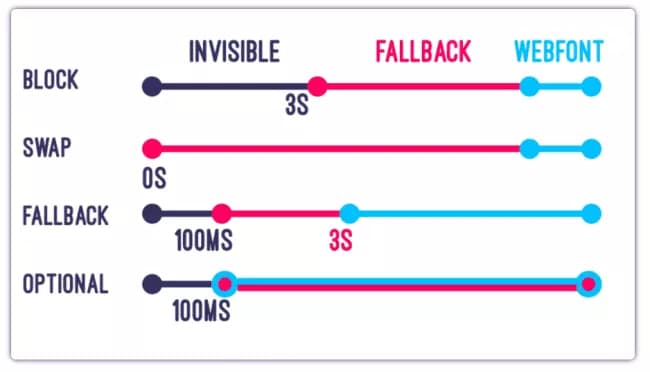 Font display property visual comparison. Note that time is not linearly scaled here. Image from speakerdeck.com
I still don’t know which to choose
If performance is priority, use font-display: optional. If displaying your font is a top priority, use font-display: swap (and deliver the font as soon as possible).
Ok I’ve got my font-display, what next?
To avoid CLS, combine link rel=preload and font-display:optional.
More CLS tips:
Use size-adjust inside your @font-face rule (ex. size-adjust: 90%;) to define how to scale a font, relative to 100%, for a minimal visual change when your font swaps. Read more on size-adjust.
Make your fallback font similar to your web font. You can use this font style matcher for some help!
FCP and LCP tips:
Largest contentful paint (LCP) and first contentful paint (FCP) are also metrics that are key to your performance score in CWV and diagnose your page performance and affect your SEO. These metrics generally measure how long your user is staring at a blank screen or loading content initially.
FCP refers to the time for the browser to render the first DOM content, for example, text or image.
LCP measures the time it takes for the largest element above the fold to load, for example, text or image.
Compressing Fonts
Below is taken from nitropack.com; link can be found below:
Embedded OpenType (EOT) - Can be served to old IE (below I9) browsers. Not compressed by default. You can apply GZIP compression to this font.
TrueType (TTF) - Can be served to old Android (below 4.4) browsers. Not compressed by default. You can apply GZIP compression to this font.
Web Open Font Format (WOFF) - Can be served to the majority of browsers. Has built-in compression.
Web Open Font Format 2 (WOFF 2) - Can be served to browsers that support it. It uses custom compression algorithms to deliver ~30% file-size reduction over other formats.
Your server should have the option to apply GZIP compression. If you’ve got a simpler stack, you can find an online tool to do the job.
Read more on loading fonts, performance, and CLS
Watch a video on font performance
Using Fonts in Code
@font-face
The font face rule defines a specific font name, variant, and file location. By using the same font name, you can construct a font-family that the browser will use to evaluate which fonts need to be downloaded. This can be more performant than alternative ways of loading fonts.
Falling back with local, woff2, and woff:
Check this example from web.dev:
@font-face {
  font-family: 'Awesome Font';
  font-style: normal;
  font-weight: 400;
  src: local('Awesome Font'),
    url('/fonts/awesome.woff2') format('woff2'),
    url('/fonts/awesome.woff') format('woff');
}

@font-face {
  font-family: 'Awesome Font';
  font-style: italic;
  font-weight: 400;
  src: local('Awesome Font Italic'),
    url('/fonts/awesome-i.woff2') format('woff2'),
    url('/fonts/awesome-i.woff') format('woff');
}
By defining the src in order of local(), then url(), we first check if the font is already installed on the user’s system, which would allow us to bypass an unnecessary network request. Next, we try to load the woff2 font. If woff2 isn’t supported, then we load the woff font. This ensures that we have performance gains from users who support woff2 and still serve the font to users who don’t. Note that unless you are using a popular font, it is very rare that your user would happen to have your font installed on their system. You can ommit the local() directive line if you’d like.
Note that for each weight and variant, you need a new @font-face rule (and you should use the same font-family name if they are of the same family of course).
If you only have woff and not woff2 or only woff2 and not woff, then ommit the declaration that you don’t have (the same way that if you have an image as a png and not as a jpg that you wouldn’t link to myfile.jpg if it doesn’t exist).
Font Subsetting (unicode ranges)
You can also define unicode ranges using @font-face:
@font-face {
  font-family: 'Awesome Font';
  src: url('/fonts/awesome-l.woff2') format('woff2');
  /* Latin glyphs */
  unicode-range: U+000-5FF;
}
Here is the unicode range for Japanese glyphs:
unicode-range: U+3000-9FFF, U+ff??;
You can find other unicode ranges as well as more info on unicode ranges online. Note that unicode range subsetting is more important for many Asian languages that have a significantly larger number of glyphs.
Google Fonts Subsets: when using google fonts, you can use &subset=latin to specify your language. Otherwise, fonts like Open Sans will fetch many different font files. Note that Latin subset is always included if available. You can also use specific text: &text=hello if you only need specific characters. If you need a special character, such as a slash ”/” then you need to URL encode it (slash is %2F so you would do &text=hello%2F so it’s treated as a character slash and not a slash in the URL). See the Google Fonts Docs on Subsets for more.
You can view the unicode range and more using wakamaifondue.com. Select a specific unicode range using unicode range selector.
If you must edit font files manually (and you really want to…), check out fonttools.
Linking CSS Files
Most people will link their stylesheet like such:
<head>
  <link rel="stylesheet" href="styles.css">
</head>
However, this is more time-consuming as the browser must first fetch your css file, then fetch the font files. Instead, consider inlining your @font-face declarations directly inside your head tag:
<head>
  @font-face {
    font-family: "Open Sans";
    src: url("/fonts/open-sans.woff") format("woff");
  }

  body {
    font-family: "Open Sans";
  }
</head>
This allows the browser to download your font sooner, since it doesn’t have to wait for your external stylesheet to load before beginning to download your font file.
Note: Use with caution. If you inline many large font files, this can slow down your website’s performance.
Preloading Fonts
If you must load your font first without loading a system default fallback first, for example, if your fonts are crucial to your brand identity, you should preload your fonts, so the browser can request them before othe resources. To quote web.dev:
This can reduce both the swap period if you use
font-display: swap, or the blocking period if you’re not usingfont-display.
More on Resource Hints
Use preload to force the browser to download the resource sooner because it is crucial to the page.
<link rel="preload" href="https://examplecdn.com/fonts/bestfont.woff" as="font" crossorigin> (add to the head tag)
Note that crossorigin is requires to be compliant with CORS and permit the browser to load resources from a cross-origin source.
More on preload, preconnect, and prefetch
Example on Google Fonts
If you go to fonts.google.com and select 300 and 500 weights of Montserrat (a gorgeous typeface I might add), then click the button on the top right to export, you can see the following code provided:
For <head>:
<link rel="preconnect" href="https://fonts.googleapis.com"><link rel="preconnect" href="https://fonts.gstatic.com" crossorigin><link href="https://fonts.googleapis.com/css2?family=Montserrat:wght@300;500&display=swap" rel="stylesheet">
<style>@import url('https://fonts.googleapis.com/css2?family=Montserrat:wght@300;500&display=swap');</style>
To use in CSS:
font-family: 'Montserrat', sans-serif;
The code in <head> will preconnect to google fonts, then fetch Montserrat at the specified weights, with display set to swap. The style tag is inserted inline directly into the <head> as well.
The default Google Fonts way of doing things is pretty good when it comes to performance.
Web Tips
Now that you’ve selected your fonts and they’re served performantly, and you know all about the basics of typography, what tips and tricks can you use to best organize and layout this type on the web?
Set your line-height between 1.2 and 1.5; Note that these values don’t have units; You can set them to 1.25rem or 16px, but then the line height won’t scale with the font size. A line height of 1.25 on the other hand, will be 1.25 times the font size and is my personal recommendation on the web.
Use rem (relative em) as your unit of measurement, and set your default font size to 1rem (16px). These units will scale with the users device and to their preferences, but will not scale to the client width.
As is true for other aspects of web design, use fixed width containers at certain breakpoints:
| Breakpoint | Properties |
|---|---|
| None | width: 100%; |
| sm (640px) | max-width: 640px; |
| md (768px) | max-width: 768px; |
| lg (1024px) | max-width: 1024px; |
| xl (1280px) | max-width: 1280px; |
| 2xl (1536px) | max-width: 1536px; |
The example above is borrowed from Tailwind’s container (you can also customize the container breakpoints and padding at each breakpoint as well).
Since you only have a few widths for you design, you have a few static layouts rather than having your page appear differently for every unique pixel on your users’ devices.
Because you are designing a small number of designs for a small number of screen widths, it is much easier to maintain and ensure that your design always looks good. This is especially true in typography, as you want to avoid orphans and other typographic bothers that would be inevidable if you were to scale fluidly.
You’ll want to organize your typography CSS rules in a single organized and separate place; I like to name mine typography.css.
In this file, I suggest applying your type scale (read more above) and defining font-size and optionally, line-height for each of your unique elements (such as h1, h2, h3, p, small). You can also define your margin-top and margin-bottom for these elements if you’d like. You can set your font-weight and should also define your font-family here.
I also suggest defining a custom font stack here, which you can read about above.
Custom Changes
Do not change the letter-spacing of the font; If it is badly kerned, use a better font. Changing the tracking of a font would be like doodling on the Mona Lisa with crayon. These values have been fine tuned after dozens to hundreds of hours. While it may not take a good type desighner to identify problems, it takes a good one to solve them. If you see letter spacing problems, use another font.
Absolutely do not use stroke or shadow changes to make a font “bolder” and do not skew your text to make it “italic.” These “faux” effects will look incorrect. If you require bold or italics, find a fontface with a bold or italic font built in.
Variable width fonts are your friend if you require many different font weights, but they still come with a slight file size cost.
Different Styles
Important: Don’t go overboard with many different font sizes, weights, styles, etc. Even two font families can be overwhelming if you have many different combinations of font size, weight, etc. Develop 3-6 styles of headings, a style for body copy, small text, and links, and use this system everywhere. You want to create a consistent design language. Typography is a system in your design, just like a color palette. You need to be consistent and establish your brand and comfort on your website. Consistent type styles will both make your site look much better and also make it much easier to use, parse, and understand. Typography can be crucial to UX.
Line Widths and Font Sizes
Use 45-90 characters per line. 60-70 is close to ideal. Tailwind CSS has the max-w-prose class that sets your max-width to 65ch (characters). Note that ch isn’t always equal to a character width, and feel free to set your max-width to a specific amount of rem based on having 60 or 70 characters per line, which depends on what font size you use for body copy. All body copy should be constrained to the exact same max width, even if the rest of the designs aren’t.
CSS frameworks will feature text sizes such as text-sm, text-lg, etc. which will set your font-size and also often set line-height and/or margin. Tailwind sets font-size and line-height for example.
Remember to use the right tool for the job. Use a font that best represents your company, brand, message, etc.
Quick Reference Measurements
Here are a few quick references for good measurements for your typography.
Font Size How large the characters are. 15-25px on a screen. 10-12pt on paper. Fonts with larger x-heights are easier to read in smaller sizes.
Related rabbit hole: When you set the font size in software, you’re really setting the size of the em square, which can sit wherever the type designer wants. Every glyph is designed around an em square and can have ascenders, descenders, swashes, etc. outside of that area. This can be important when combining fonts that have different appearances and wanting text with the same font size to appear as the same height. Further reading on em squares
Heading Font Size Primary heading: 175%-200% of the body text size.
Secondary heading:125%-150% of the body text size.
Tracking Space between letters. Try not to change this, unless absolutely necessary, or stylistically for a heading.
Kerning Individual spacing for specific pairs of characters, such as the space between “c” and “h.” These values are fine tuned after many hours and you won’t be touching them. This is why you don’t want to change tracking, which is the spacing between all characters.
Leading Line height. Refers to the lead from metal type. 120% to 150% of text size. Changes based off of text size and x-height.
Line Length / Column Width How many characters per line (average). 45-90, but ideally 60-70 chracters per line.
Alignment
You can left, center, or right align text. Generally, avoid the temptation of aligning text to the center. If writing a left-to-right (LTR) language (such as English), you’ll want to stick with left alignment on all body copy. Headings are a stylistic choice but do not have to be centered. The same way that subheadings and headings can differ in font family, weight, and size, they can differ in alignment. Generally, you want elements of your design to align, so if there is a left aligned image right below your heading, you may want to left align the heading.
Licensing
There are many different types of licenses (as with other digital media), and you should be aware and ensure to comply with the licenses or you may be in for some trouble down the line.
Some licenses allow you to use a font based on number of viewers, based on the platform (website, app, commercials, print), and licenses will generally tell you what you can and can’t do to the files, such as change, distribute, charge money for, etc. For a hobbyist, “free for personal use” should be good enough for you; just make sure you aren’t violating the licenses if you are interested in changing things up or sharing a file.
Accents
Accents such as acute (é), grave (è), tilde (ñ) are common in many languages and often included in font files. If you’re designing a font, this is a big rabbit hole, but for someone simply using a font, there are just a few things to keep in mind:
- Most professional fonts will include many of these
- Most font files will not store redundant data (ie. store the vector for the letter “A” over and over again). See Coding Adventure: Rendering Text by Sebastian Lague for a deep dive on how font files work (it’s a great video, but certainly venturing off-topic for this article!)
- You can select specific unicode ranges for your fonts and the font will only use that range. You can look at all of the glyphs in a font file on wakamaifondue.com, which is an amazing site (he also writes about the variable font inheritance problem, which is only relevant if you use variable fonts)
Further reading: https://www.myfonts.com/pages/fontscom-learning-fontology-level-3-signs-and-symbols-accents
Dos and Do Nots
Do:
Do ensure your line length, line height, and other metrics mentioned above are legible
Do ensure that your typeface(s) are appropriate for your setting
Do ensure that you use well designed and trusted fonts
Do ensure that your font pairs work well together
Do be sure to use a few different variations of font size, weight, and style to provide contrast and visual hierarchy
Do not:
Do not use too many different font styles (such as ten different sizes, eight weights, and four font families all mixed and matched). Stick to a design system instead and only use the appropriate type styles for headings, subheadings, body copy, captions, quotes, authors, tags, and whatever other styles are defined in that style guide.
Do not load many different fonts and variations to your webpage
Do not combine more than three typefaces
Do not manually adjust the tracking unless absolutely necessary
Do not use methods of creating a “fake” bold or use faux italics
Do not use a typeface that is hard to read for body copy (or in general… but especially for body copy)
Where to Search
A font foundry is a company that designs or distributes typefaces. The name comes from when type was sold as physical wood or metal pieces. Now in the digital age, you can search font foundary websites and sort by different values and select the typeface(s) that you’d like. Note that some are free and some are paid. There are plenty of great free fonts out there, but if you are establishing a large company and want to command respect, you’ll want a design agency to pick out your fonts (along with your logo, colors, iconography, etc.) and these fonts can cost hundreds or thousands of dollars depending on designer, foundary, licensing, use case, etc. However, for the casual designer, there are a great number of excellent typefaces available for free on Google Fonts and other foundaries:
Google Fonts (free)
Fonts.com (paid but affordable)
Adobe Fonts (free if you have a creative cloud subscription)
Displaay.net (paid premium fonts)
These are just a handful of examples, and a quick search will find you many more. Don’t feel confined to just these few examples.
Slightly off-topic, but on Type Wolf you can read up about the latest typography design trends and about type in general.
Font History
I’ve generally neglected font history in this article, however, I think it can be left to this incredible video on font history by struthless
References
Websites:
Videos:
These are some of the best videos I’ve found on typography. Sit back, relax, and learn away. View with or send to a friend too : )
Books:
Designing Type - All about creating a typeface, one letterform at a time. Dive deep into every single part of a font and learn about how to create your own.
Essential Type - Serves as a quick glossary for typography terminology and how to understand and use fonts. Well structured, portable, and great images.
Thinking with Type - A guide for using type in your designs. Plenty of examples, history, and explanations of where to use and not use fontfaces.
I highly recommend all three of the above books.
More Blog Articles